In this article we are going to learn about how to use tailwind with svelte
- Creating a Svelte App
- Installing and Configuring Tailwind in Svelte App
- Creating re-usable button with Svelte and tailwind
- Different customization options with tailwind CSS and Svelte
- Component design with tailwind css and Svelte
- State and event management in Svelte components with Tailwind
- Integrating Tailwind CSS utility classes with Svelte animations
- Conclusion
In this article we are going to learn about how to use tailwind css with svelte
Creating a Svelte app
Let us create a Svelte app and then add tailwind to it.
Type the below code to initialize a new project
npm init svelte@latest demo-app
cd demo-app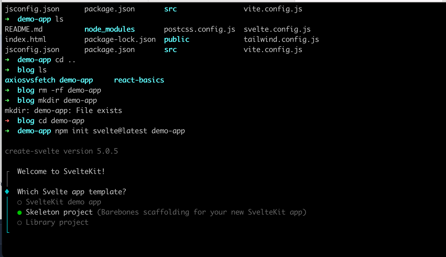
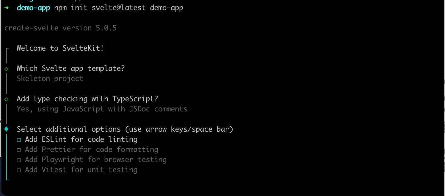
It is going to ask you some questions and you can select the options based on your preferences.
Once you have installed the app run
npm installto install all the dependencies
then run the below command
npm run devto start the application
this will start your application in localhost 5173
Installing and Configuring Tailwind in Svelte App
We have our Svelte app running, let's add tailwind to the project
Step 1: to install the tailwind, type this code in your terminal
npm install -D tailwindcss postcss autoprefixer
npx tailwindcss init -pStep 2: then open the file svelte.config.js
there import the vitePreprocess and add the preprocess in the config like so

import adapter from '@sveltejs/adapter-auto';
import { vitePreprocess } from '@sveltejs/kit/vite';
/** @type {import('@sveltejs/kit').Config} */
const config = {
	kit: {
		// adapter-auto only supports some environments, see https://kit.svelte.dev/docs/adapter-auto for a list.
		// If your environment is not supported or you settled on a specific environment, switch out the adapter.
		// See https://kit.svelte.dev/docs/adapters for more information about adapters.
		adapter: adapter()
	},
	  preprocess: vitePreprocess()
};

export default config;
Step 3: After this open the tailwind.config.js file to configure the template paths like
This article is brought to you by DeadSimpleChat, Chat API and SDK for your website and app
/** @type {import('tailwindcss').Config} */
export default {
  content: ['./src/**/*.{html,js,svelte,ts}'],
  theme: {
    extend: {}
  },
  plugins: []
};Step 4: After this create a new file named app.css in the ./src folder
@tailwind base;
@tailwind components;
@tailwind utilities;Step 5: Create a svelte file named +layout.svelte in the ./src/routes/+layout.svelte and import the app.css file
<script>
  import "../app.css";
</script>

<slot />Step 6: Run the application
npm run startStep 7: Start using tailwind in your application
When using Tailwind remember to add lang="postcss" for any <style> blocks that needs to be processed by tailwind
<h1 class="text-3xl font-bold underline">
    We are running tailwind in Svelte!
  </h1>

  <style lang="postcss">
    :global(html) {
      background-color: theme(colors.indigo.100);
    }
  </style>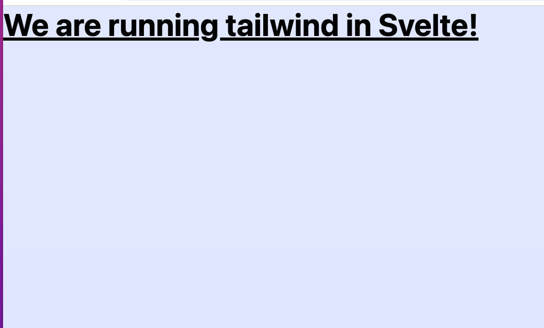
Example: Creating a Reusable button with tailwind and Svelte
Let us create a reusable button with tailwind and Svelte Kit
Step 1: Creating a button component file
In our Svelte application create in new Svelte component file and name it Button.svelte.
Create this file inside src/lib folder. You can do this through UI in VS Code or use the terminal
touch src/lib/Button.svelteStep 2: Creating the component
In the file Button.svelte write the below code
This article is brought to you by DeadSimpleChat, Chat API and SDK for your website and app
<script>
    export let buttonText = "Reusable Button";
    export let buttonStyle = "bg-blue-200 hover:bg-blue-700 focus:outline-none focus:ring-4 focus:ring-blue-300";
    export let textSize = "base";
  </script>

  <style>
    .base {
      @apply text-white font-bold py-2 px-4 rounded cursor-pointer;
    }

    .sm {
      @apply text-sm;
    }

    .base {
      @apply text-base;
    }

    .lg {
      @apply text-lg;
    }
  </style>

  <button class="{textSize} {buttonStyle}">
    {buttonText}
</button>What we are doing here?
We are exporting three props here
- buttonText : for the text that is displayed on the button.
- buttonStyle: To define button style
- textSize: The size of the text inside the button
In the style section we have the tailwind utility classes for the button
We are using the @ directive here to apply the tailwind utility classes
Lastly, we are defining the button with the tailwind classes and the buttonText
Step 3 : Using the Button component in our Svelte page
We are going to use the button component that we just created in our svelte page
open the +page.svelte and import the Button.svelte in it
like
<script>
  import Button from '$lib/Button.svelte';
</script>

<main class="space-y-2">
  <Button buttonText="Primary Button" buttonStyle="bg-blue-500 hover:bg-blue-700" size="sm" />

  <Button
    buttonText="Secondary Button"
    buttonStyle="bg-green-500 hover:bg-green-700 focus:ring-green-300"
  />

  <Button buttonText="Danger Button" buttonStyle="bg-red-500 hover:bg-red-700" size="lg" />
</main>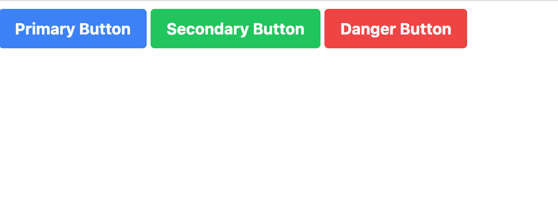
In this example we have created the svelte app and created three button with tailwind css
Different customization options with tailwind CSS and Svelte
- Changing button Colors
Easily customize the button color by using built in tailwind CSS color classes, you can also create custom colors using the configuration file
<main class="space-y-2">
  <Button buttonText="Primary Button" buttonStyle="bg-blue-500 hover:bg-blue-700" />

  <Button
    buttonText="Secondary Button"
    buttonStyle="bg-green-500 hover:bg-green-700"
  />

  <Button buttonText="Danger Button" buttonStyle="bg-red-500 hover:bg-red-700" />

  <Button buttonText="Info Button" buttonStyle="bg-indigo-500 hover:bg-indigo-700" />
</main>
2. Adding icons to the buttons
You can easily added icons to the buttons as well. To do this install the heroicons npm package
npm install svelte-hero-iconsNow, let us modify our Button.svelte component to accept the new icon prompt and include the icon in the markup
<script>
// Importing from svelte-her-icons
    import { Icon, ArrowUp, } from "svelte-hero-icons";
    export let buttonText = "Reusable Button";
    export let buttonStyle = "bg-blue-200 hover:bg-blue-700 focus:outline-none focus:ring-4 focus:ring-blue-300";
    export let textSize = "base";
  </script>

  <style>
    .base {
      @apply text-white font-bold py-2 px-4 rounded cursor-pointer;
    }

    .sm {
      @apply text-sm;
    }

    .base {
      @apply text-base;
    }

    .lg {
      @apply text-lg;
    }
  </style>

  <button class="{textSize} {buttonStyle}">
    <Icon src="{ArrowUp}" size="32"/>
    {buttonText}
  </button>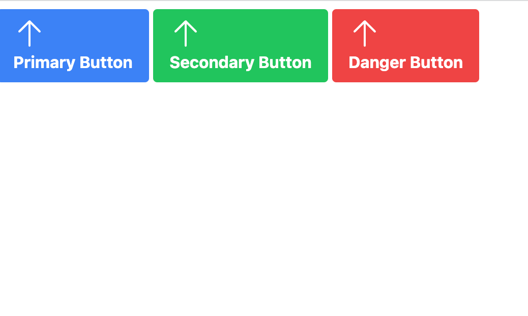
In the above example we have imported the heroicons package and added the arrow icons to our buttons
Component design with tailwind css and Svelte kit
In this section we will explore component design with tailwind and Svelte Kit
We are going to learn component design with the help of an example
Step 1: Card Component
In our project, let us create an new file Card.svelte in the directory src/lib
touch src/lib/Card.svelteStep 2: Creating the component into small reusable parts
To improve component design we will design our component into smaller reusable parts
Let us create the parts of out card component
CardHeaderCardBodyCardFooter
Let us create separate files for these components in the src/lib directory
touch src/lib/CardHeader.svelte
touch src/lib/CardBody.svelte
touch src/lib/CardFooter.svelte
Step 3: Creating the Sub Component
We will create sub components using slots, that will help us creating customizable components and with content injection as well
CardHeader.svelte
<script>
  export let title = "Card Title";
</script>

<header class="bg-blue-200 text-white p-4">
  <h2 class="text-xl font-bold">{title}</h2>
  <slot name="actions" />
</header>CardBody.svelte
<div class="p-4">
  <slot />
</div>CardFooter.svelte
<footer class="border-t p-4">
  <slot />
</footer>Step 4: Creating the main Card Component
Next we will combine the subcomponents to create the main.svelte component file
We will be using Svelte slots to be able to inject the sub components into the main component
main.svelte
<script>
  import CardHeader from "./CardHeader.svelte";
  import CardBody from "./CardBody.svelte";
  import CardFooter from "./CardFooter.svelte";
</script>

<div class="w-full md:w-1/2 lg:w-1/3 border shadow-lg rounded overflow-hidden">
  <slot name="header">
    <CardHeader />
  </slot>
  <slot name="body">
    <CardBody />
  </slot>
  <slot name="footer">
    <CardFooter />
  </slot>
</div>Now, we will use the main card component on a svelte page
<script>
  import Card from "$lib/Card.svelte";
  import CardHeader from "$lib/CardHeader.svelte";
  import CardBody from "$lib/CardBody.svelte";
  import CardFooter from "$lib/CardFooter.svelte";
</script>

<style>
  .button {
    @apply bg-blue-600 py-2 px-4 text-white rounded mt-2;
  }
</style>

<main class="flex space-x-8">
  <Card>
    <CardHeader slot="header" title="Header Slot" />
    <CardBody slot="body">
      <p>Some Card Component goes here</p>
    </CardBody>
    <CardFooter slot="footer">
      <button class="button">Footer</button>
    </CardFooter>
  </Card>

  <!-- 2 card example -->
  <Card>
    <CardHeader slot="header">
      <h2 class="text-xl font-bold text-blue-500">No actions</h2>
    </CardHeader>
    <CardBody slot="body">
      <p>Some next card component goes here</p>
    </CardBody>
  </Card>
</main>
In the above example we added the card component into 2 separate configurations
Thus we are able to re use and maintain the single card component on multiple places and different configurations
Thus creating smaller re usable components and later joining them to create larger components leads to more flexible design.
Integrating Tailwind utility Classes with Svelte Animations
We have built in animation and transition support in Svelte. Let us see how we can integrate tailwind utility classes with svelte animations
Step 1: Importing Svelte animation and easing
To add animations to Svelte we have import the animations and easing functions from svelte/animate and svelte/easing modules
<script>
  import { fly } from "svelte/animate";
  import { cubicOut } from "svelte/easing";
</script>Step 2: Adding Tailwind utility classes to Svelte animations
We have to define the animation config using the animate directive in our component markup and apply the utility classes as we want to
<div
  class="bg-blue-00 text-white text-center py-2 px-4 my-4 rounded shadow"
  in:fly="{{ y: -50, duration: 300, easing: cubicOut }}"
  out:fly="{{ y: 50, duration: 300, easing: cubicOut }}"
>
 	Animating the text(fly)
</div>We are appling the tailwind CSS bg-blue-200, text-red px-4 and other tailwind utility classes for styling at the same time we are using Svelte fly animation for in and out transitions.
Step 3: Animate multiple elements at the same time
We can create concurrent animations using svelte and tailwind. To do this we need to use each blocks along with the animate directive
<script>
  let notifications = [
    "New website!",
    "Svelte + Tailwind utility classes",
    "We are animating the classes!",
  ];
</script>

{#each notifications as notification, index (index)}
  <div
    class="bg-green-500 text-white text-center py-2 px-4 my-4 rounded shadow"
    in:fly="{{ y: -50, duration: 300, delay: index * 50, easing: cubicOut }}"
    out:fly="{{ y: 50, duration: 300, delay: index * 50, easing: cubicOut }}"
    key="{index}"
  >
    {notification}
  </div>
{/each}Here we created a list of notifications and used each to render the elements
We are notifications has the fly animations while enteringand leaving
We are integrating Tailwind CSS utility with Svelte. Using this you can create awesome animations and do performance optimization as well
Benefits and advantages of using Svelte with Tailwind
Lastly, let us consider some of the benefits and advantages of using svelte with tailwind
- Having a utility first approach
- Scoped styles and ability to make components
- Easy to structure responsive design
- Small CSS bundle size
- Fully integrated developer experience
- Having a utility first approach: Tailwind has a utility first approach. This gives you control over styling and makes for easy styling and better consistency through the project.
<!-- Styling a button with tailwind -->
<button class="bg-blue-500 hover:bg-blue-200 text-white font-bold py-2 px-4 rounded">
	Super Buy Now
</button>
2. Scoped Styles and ability to make components: Using tailwind with Svelte you can directly apply utility classes to Svelte components, giving you the ability to encapsulate the styles for a perticular component. Thus creating individually styled and scoped components
<!-- Button.svelte with tailwind -->
<style>
  .container {
    @apply bg-blue-200 hover:bg-blue-300 text-white font-bold py-2 px-4 rounded;
  }
</style>

<button class="container">
  Buy Now
</button>3. Create Responsive designs: Svelte has responsive and reactive components built in and tailwind also supports responsive design with easy to use breakpoints.
<!--  Tailwind responsive layout-->
<div class="container mx-auto px-4 md:px-8">
  <div class="grid grid-cols-1 md:grid-cols-3 gap-4">
    <div class="bg-white p-4 shadow rounded">
      <!-- Svelte Component or content here -->
    </div>
    <!-- Other columns... -->
  </div>
</div>4. Minimized CSS bundle size: In tailwind 3 only the classes that are being used are included in the bundle thus reducing the size of the CSS bundle also in Tailwind 2 with purge css the size of the css bundle is significantly reduced
5. Integrated developer experience: With Svelte and tailwind can be easily integrated into a single development file thus avoids switching between CSS files and Svelte files
module.exports = {
  plugins: [
    require('tailwindcss'),
    require('autoprefixer'),
  ],
};
State and event management in Svelte components with tailwind
In this section we will look at state and event management in Svelte components that are using tailwind for styling
step 1: Create a Svelte component with tailwind
We are creating a new component called Counter.svelte and we have a <script> tag inside it. We have also declared a variable called count
Then we are adding Tailwind utility classes to it to add styling
<script>
  let count = 0;
</script>

<div class="bg-white shadow-md rounded p-4 w-full max-w-xs mx-auto">
  <p class="text-xl font-semibold text-gray-800">People: {count}</p>
</div>
Step 2: Adding buttons to update the state
Next, we will create button to change the state and add tailwind utility classes for styling.
We are also adding event listners to the click event using the Svelte on: directive and we will update the count on the click of the button
<script>
  let count = 0;

  function increment() {
    count++;
  }

  function decrement() {
    count--;
  }
</script>

<!-- Add buttons to change the state -->
<div class="bg-white shadow-md rounded p-4 w-full max-w-xs mx-auto">
  <p class="text-xl font-semibold text-gray-800">Counter: {count}</p>

  <div class="flex space-x-2 mt-4">
    <button
      class="bg-blue-500 text-white py-1 px-3 rounded"
      on:click="{add}"
    >
      Increment
    </button>
    <button
      class="bg-red-500 text-white py-1 px-3 rounded"
      on:click="{subtract}"
    >
      Decrement
    </button>
  </div>
</div>
Step 3: Handle events with Svelte and tailwind
Based on the changes in a child component we need to update the parent component
To do this we are going to import the createEventDispatcher function and use it to dispatch custom events
In the Counter.svelte file we will dispatch a new countUpadted event each time a count is updated
<script>
  import { createEventDispatcher } from "svelte";
  const dispatch = createEventDispatcher();
  let count = 0;

  function increment() {
    count++;
    dispatch("countUpdated", { count });
  }

  function decrement() {
    count--;
    dispatch("countUpdated", { count });
  }
</script>

<!-- code -->
In the parent component listen to the countUpdated event and update the parent component as required
<script>
  import Counter from "./Counter.svelte";
  let totalCount = 0;

  function handleCountChanged(event) {
    totalCount = event.detail.count;
  }
</script>

<Counter on:countChanged="{handleCountChanged}" />

<p>Total count: {totalCount}</p>
Need Chat API for your website or app
DeadSimpleChat is an Chat API provider
- Add Scalable Chat to your app in minutes
- 10 Million Online Concurrent users
- 99.999% Uptime
- Moderation features
- 1-1 Chat
- Group Chat
- Fully Customizable
- Chat API and SDK
- Pre-Built Chat
Conclusion
In this tutorial we learnt about creating a Svelte app and how to integrate Tailwind CSS with svlete app
Thank you for reading the article. I hope you liked the article
Ready to Add Chat to Your Website?
Get started for free. No credit card required.
Start a Free Trial
![Webinar Chat: The Complete Guide to Engaging Your Audience [2026]](/blog/content/images/size/w600/2026/02/article-hero-webinar-chat.svg)