Introduction
- Breakpoints
- What are dynamic breakpoints and Container Queries?
- Dynamic Breakpoints in Tailwind CSS
- Default Tailwind CSS breakpoints
- Customizing breakpoints in
tailwind.config.js - Example of Breakpoint: Responsive Navbar with tailwind
- Example 2 of Breakpoint: Responsive Grid Layout with tailwind
2. Container Queries
- What are Container Queries?
- Container vs Media Queries: A comparison
- Container Queries in Tailwind CSS
- Using Container Queries with PostCSS plugins
- Configuring
tailwind.config.jsfor container queries
3. Combining Dynamic Breakpoints and Container Queries
- Use-cases for combining dynamic breakpoints and container queries
- Example: Responsive dashboard layout with tailwind CSS
4. Best Practices
- How to use dynamic breakpoints and container queries
- How to avoid common mistakes
5. Conclusion
- Thank you for reading the article
In this article we are going to learn about dynamic breakpoints and Container queries in tailwind CSS
What are dynamic breakpoints and Container Queries?
To accommodate different screen sizes and resolutions, there are points in a website's layout where design changes can occur.
Basically, Breakpoints adjust the styling of the webpage or the HTML elements on the webpage based on the width of the viewport.
Thus enabling responsive design and allowing the website to adapt to different screen sizes
Example:
/*Dynamic breakpoints using media queries */

@media (max-width: 768px) {
  .element {
    /* styles for screen sizes smaller than 768px */
  }
}Container Queries
Rather than using the entire viewport to adjust the styles of HTML on the webpage.
We can use the size of the element's container (the container inside which that particular element is present)
This allows for a lot modular approach and flexible components. That can be reused in other elements as well
Example:
/* container queries are not supported widely across browsers */

.element:container(max-width: 300px) {
  /* here you can write styles for container that has a max width of  300px */
}Dynamic Breakpoints in Tailwind CSS
Tailwind is a framework that has revolutionized the Front-end development.
There are a set of pre defined breakpoints in tailwind CSS that you can use out of the box to create responsive designs
<!-- Tailwind CSS breakpoints Example -->
<div class="bg-blue-200 md:bg-gray-200 lg:bg-indigo-500">
    The div is going to change the background color based on the size of the viewport
</div>Default Tailwind CSS breakpoints
Tailwind CSS provides the following default breakpoints
- sm: 640px
- md: 768px
- lg: 1024px
- xl: 1280px
- 2xl: 1536px
This is how you can use the breakpoints in your HTML
<!--default breakpoints example -->
<div class="text-xs sm:text-sm md:text-base lg:text-lg xl:text-xl 2xl:text-2xl">
  Here we are changing the font size of the text based on the view port size
</div>
Customizing breakpoints in tailwind.config.js
- To customize the breakpoints we need to edit or create the
tailwind.config.jsfile in our project's root folder - Find the
themeObject in the cinfig file and add or edit thescreensproperty inside thethemeObject. Here you can define custom screen breakpoints or edit the existing breakpoints to custom sizes - Let us consider an example below where we are adding two new breakpoints namely
3xland4xl
//file tailwind.config.js
module.exports = {
  theme: {
    extend: {
      screens: {
        '3xl': '1920px',
        '4xl': '2560px',
      },
    },
  },
  variants: {},
  plugins: [],
}Real life examples of dynamic breakpoints
Example 1: Create a Responsive Nav bar
<script src="https://cdn.tailwindcss.com"></script>

<!-- Responsive Nav bar demo using Tailwind CSS -->
<nav class="bg-gray-500 p-4">
  <div class="container mx-auto">
    <div class="flex justify-between items-center">
      <div class="text-white font-bold text-lg">
        Your Brand Name here
      </div>
      <div class="hidden md:flex">
        <a href="#" class="text-white mx-2">Services</a>
        <a href="#" class="text-white mx-2">Products</a>
        <a href="#" class="text-white mx-2">Blog</a>
      </div>
      <button class="md:hidden text-white">
        <!-- hamburger icon here -->
        <svg xmlns="http://www.w3.org/2000/svg" fill="none" viewBox="0 0 24 24" stroke="currentColor" width="24" height="24">
          <path stroke-linecap="round" stroke-linejoin="round" stroke-width="2" d="M4 6h16M4 12h16M4 18h16" />
        </svg>
      </button>
    </div>
  </div>
</nav>
In the above example the navigation screens are hidden on small screens and shown on md to larger screens
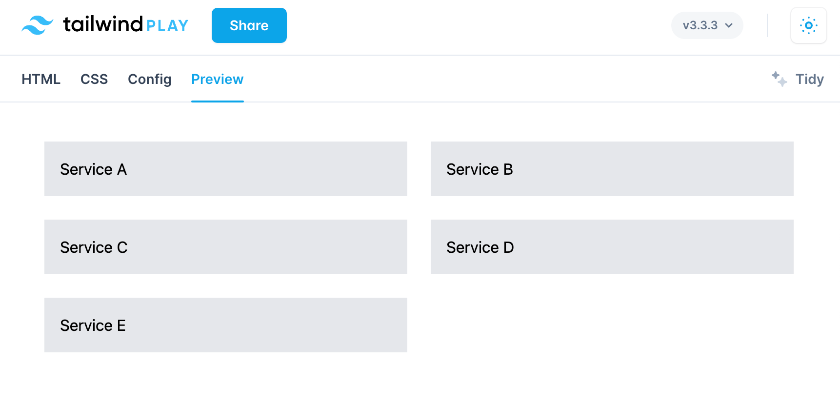
Example 2: Responsive Grid Layout
- The Grid layout will adopt a different size according to the viewport size
- We are doing this by implementing CSS Grid in Tailwind with classes such as `md:grid-col-2 only 2 grid column in medium sized viewport and
lg:grid-col-33 grid columns in large sized viewport.
<script src="https://cdn.tailwindcss.com"></script>

<!-- example of responsive grid layout -->
<div class="container mx-auto">
  <div class="grid grid-cols-1 gap-4 md:grid-cols-2 lg:grid-cols-3">
    <div class="bg-gray-200 p-4">Service A</div>
    <div class="bg-gray-200 p-4">Service B</div>
    <div class="bg-gray-200 p-4">Service C</div>
    <div class="bg-gray-200 p-4">Service D</div>
    <div class="bg-gray-200 p-4">Service E</div>
  </div>
</div>
What are Container Queries?
- With Container queries you can apply styles based on the size of the container an element resides in rather than on the entire viewport
- This technique makes it possible to create flexible containers that can adapt to their surrounding and can be used in multiple pages across multiple webpage design layouts
- Container queries are not supported by all the major browsers but can be used with third party libraries and frameworks like PostCSS and Tailwind
Container Queries Vs Media Queries
Here are some of the differences between Container Queries and Media Queries.
- Media queries
- Apply styles based on the size of the view port
- All modern browsers support Media Queries
- Cannot create small responsive components that adapt to container size because it is based on the size of the container rather than the size of the viewport
Example of Media Queries
/* using media queries for styles greater than 768px*/
@media (min-width: 768px) {
  .element {
    /* write styles for screen sizes greater than 768 px */
  }
}
2. Container queries
- Styles are based on the size of the container rather than that of the viewport as in the case of Media Queries
- Need to be implemented using work around like PostCSS and Tailwind. Container queries are not supported by modern browsers out of the box.
- Container Queries you can create more modular and flexible components that can be used on multiple webpages
Example:
 .element:container(min-width: 300px) {
	/* write your styles here */
}Implementing Container Queries in Tailwind CSS
To implement container queries in tailwind css you have to use the PostCSS plugins like postcss-container-queries . Here is a rundown on how you can achieve this
- Installing the plugin in your project
npm install postcss-container-queries --save2. Configure the plugin in the postcss file postcss.config.js
// file name postcss.config.js
module.exports = {
  plugins: [
    require('postcss-container-queries'),
    require('tailwindcss'),
    require('autoprefixer'),
  ],
}3. adding the necessary styles to our css file
/* Example os using container queries with postcss plugin*/
.container {
	contain: size layout;
  }

.element {
	/* default styles */
  }

.container:container(min-width : 768px) .element {
	  /* write your styles here */
	}
4. Adding the container class to the parent element in HTML like so
<div class="container">
  <div class="element">The element sizes will changes based on the size of the container</div>
</div>
Configure tailwind.config.js for container queries
- It is not nessesssory to configure tailwind.config.js for container queries. However, you can make some changes to the tailwind config file to make work smoothly with container queries.
- As an example We can create custom container sizes to apply container styles
Example:
Defining custom container sizes :
// file name: tailwind.config.js
module.exports = {
  theme: {
    extend: {
      container: {
        small: '200px',
        medium: '400px',
        large: '600px',
      },
    },
  },
  variants: {},
  plugins: [],
}
Creating utility classes for container styles
// tailwind.config.js
module.exports = {
  theme: {
    extend: {
      backgroundColor: {
        'element-small': '#fbfbfbf',
        'element-medium': '#fffff',
        'element-large': '#bbb3bbb',
      },
    },
  },
  variants: {},
  plugins: [],
}
Using the utility classes that we created in our CSS file
/* using the utility classes that we created in our container */
.container:container(min-width: 200px) .element {
	background-color: theme('backgroundColor.element-small');
  }

.container:container(min-width: 400px) .element {
	background-color: theme('backgroundColor.element-medium');
  }

.container:container(min-width: 600px) .element {
	background-color: theme('backgroundColor.element-large');
  }
This examples demonstrates how you can use custom container sizes and utility classes inside you tailwind config file
Use-Cases for Dynamic Breakpoints and Container Queries
- With Dynamica breakpoints and container queries you can create increadbly responsive designs that change with the viewport and are modular as well
- You can also create complex Grid layouts where individual components and elemenst inside the component change shape according to the screen size
- You can also create elements that change their size and styling based on both the viewport size and the size of the container they are in
Example: Building a Responsive Dashboard
- Installing the plugin in your project
npm install postcss-container-queries --save2. Configure the plugin in the postcss file postcss.config.js
// file name postcss.config.js
module.exports = {
  plugins: [
    require('postcss-container-queries'),
    require('tailwindcss'),
    require('autoprefixer'),
  ],
}3. Next, add the styling in your CSS file
/* styles.css */
.container {
	contain: size layout;
  }

  .widget {
	/* default style of the widget */
	background-color: blue;
	color: white;
	padding: 1rem;
  }

  .container:container(min-width: 400px) .widget {
/* styles widget that have a container size larger than 400px */
	background-color: red;
  }
4. Creating responsive dashboard layout using Tailwind CSS and container queries
<div class="grid grid-cols-1 gap-4 md:grid-cols-2 lg:grid-cols-3">
  <div class="container">
    <div class="widget m-4">Widget A</div>
  </div>
  <div class="container">
    <div class="widget m-4">Widget B</div>
  </div>
  <div class="container">
    <div class="widget m-4">Widget C</div>
  </div>
  <div class="container">
    <div class="widget m-4">Widget D</div>
  </div>
  <div class="container">
    <div class="widget m-4">Widget E</div>
  </div>
</div>

<!-- Resposive dashboard Example with container queries and tailwind css -->
Need Chat API for your website or app
DeadSimpleChat is an Chat API provider
- Add Scalable Chat to your app in minutes
- 10 Million Online Concurrent users
- 99.999% Uptime
- Moderation features
- 1-1 Chat
- Group Chat
- Fully Customizable
- Chat API and SDK
- Pre-Built Chat
Conclusion
In this article we learned about tailwind CSS and how to use dynamic breakpoints and container queries in development of responsive websites and apps
I hope you like the article. Thank you for reading
Ready to Add Chat to Your Website?
Get started for free. No credit card required.
Start a Free Trial
![Webinar Chat: The Complete Guide to Engaging Your Audience [2026]](/blog/content/images/size/w600/2026/02/article-hero-webinar-chat.svg)