Dead Simple Chat offers powerful Javascript Chat SDK and APIs that you can use to easily add Chat functionality to your React Applications.
In this blog post, we will learn what are Higher Order Components, and learn about common use-case patterns. We will also look at code examples of common use-case patterns using Higher Order Components.
- What are Higher Order Components?
- Basic Example of HOC
- Common Use Case Patterns of Higher Order Components
- Naming Conventions
- Conclusion
What are HOCs in React?
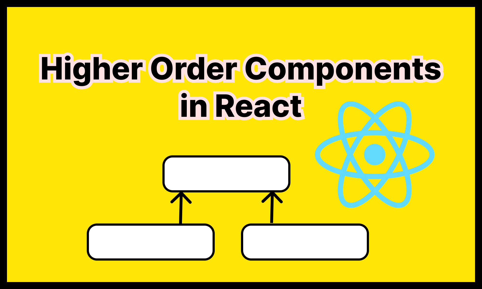
Higher Order Components or HOC are basically functions that take a component as an argument and return a new component.
Higher Order Components are useful to abstract a shared logic used by many components.
Components in React allow code reuse and prevent code repetition.
But when you develop a React application it is not always straightforward to apply the DRY principles and you have to write repeated code in multiple components.
But by using HOCs you can reduce the repeated code, by encapsulating that logic into a Higher Order Component. We will look at some examples and patterns below.
Basic HOC Example
Let's look at a very basic example, to understand Higher Order Components.
This is a very basic example and in the real world it will not make sense to encapsulate the logic into Higher Order Components but it would serve as a good example to understand Higher Order Components.
We will also look at examples and scenarios later in this blog post where to use Higher Order Components in real-world use cases.
Let's look at our example, we will create a React Component that upon hover its background color changes to blue.
const TextComponent = ({ text }) => {
  const [isHovered, setHovered] = useState(false);

  function handleMouseEnter() {
    setHovered(true);
  }

  function handleMouseLeave() {
    setHovered(false);
  }

  return (
    <>
      <p
        style={{ backgroundColor: isHovered ? "blue" : "white" }}
        onMouseEnter={handleMouseEnter}
        onMouseLeave={handleMouseLeave}
      >
            { text }
      </p>
    </>
  );
};
We have created a simple React Componenet called as the TextComponent and when the mouse is hovered upon the TextComponent its background color changes to blue.
To achieve this we are using the isHovered variable and setting it to true on the MouseEnter event and then resetting it to false on MouseLeave event.
However, if we want to add this same functionality into other components in our application, then we would have to repeat the same code, again in the other components.
To prevent this we can wrap the logic to detect the hover in a Higher Order Component, lets see an updated example using Higher Order Components.
// Higher Order Component that Contians the logic
// to detect the hover.
function withHover(WrappedComponent) {
  return function (props) {
    const [isHovered, setHovered] = useState(false);

    function handleMouseEnter() {
      setHovered(true);
    }

    function handleMouseLeave() {
      setHovered(false);
    }

    return (
      <div onMouseEnter={handleMouseEnter} onMouseLeave={handleMouseLeave}>
        <WrappedComponent {...props} isHovered={isHovered} />
      </div>
    );
  };
}

// Updated Text Component without the Hover Logic
const TextComponent = ({ text, isHovered }) => {
  return (
    <>
      <p style={{ backgroundColor: isHovered ? "blue" : "white" }}>{text}</p>
    </>
  );
};

// Updated Input Component without the Hover Logic
const InputComponent = ({ type, isHovered }) => {
  return (
    <input
      type={type}
      style={{ backgroundColor: isHovered ? "blue" : "white" }}
    />
  );
};

// Creating components that contain hover logic using
// Higher Order Component.
const TextComponentWithHover = withHover(TextComponent);
const InputComponentWithHover = withHover(InputComponent);

// Using the Components in our App
const App = () => {
  return (
    <div className="App">
      <TextComponentWithHover
        text="Lorem ipsum dolor sit amet, consectetur adipiscing elit, sed do eiusmod
        tempor incididunt ut labore et dolore magna aliqua. Ut enim ad minim
        veniam, quis nostrud exercitation ullamco laboris nisi ut aliquip ex ea
        commodo consequat."
      />

      <InputComponentWithHover type="text" />
    </div>
  );
};

export default App;
In the above code example, we have created a Higher Order Component named withHover.
In the withHover Higher Order Component, we are handling the MouseEnter and MouseLeave events and setting the value of isHovered to true when there is a hover over the componenet.
We are also passing the isHovered as a prop to the WrappedComponent and we use this prop to handle the hover condition in the WrappedComponents.
We have also updated the TextComponent and the code of the TextComponent has become much smaller. In the TextComponent we are just checking if the isHover the prop is set to true and if it is set to true then we are setting the background color to blue.
Common Use Case Patterns for HOCs
Now let's discuss some common use case patterns where using Higher Order Components would be beneficial.
1. Management of State and Handling of Async Data
Higher order components can be used to manage state and perform async data retrieval and normal components would be focused on displaying the data.
This results in the creation of loosely coupled components with a clear separation of roles. Let's look at an example:
Example:
import "./styles.css";
import { useState, useEffect } from "react";

function withDataFetch(WrappedComponent, fetchData) {
  return function (props) {
    const [data, setData] = useState(null);
    const [isLoading, setIsLoading] = useState(true);
    const [error, setError] = useState(null);

    useEffect(() => {
      const fetchWrapper = async () => {
        try {
          const data = await fetchData(props);
          setData(data);
          setIsLoading(false);
        } catch (error) {
          setError(error);
          setIsLoading(false);
        }
      };
      fetchWrapper();
    }, [props]);

    return (
      <WrappedComponent
        {...props}
        data={data}
        isLoading={isLoading}
        error={error}
      />
    );
  };
}

const fetchPosts = async () => {
  const response = await fetch("https://jsonplaceholder.typicode.com/posts");
  const data = await response.json();
  return data;
};

const PostComponent = ({ data, isLoading, error }) => {
  if (isLoading) return <p>Loading...</p>;
  if (error) return <p>Error: {error.message}</p>;

  return (
    <ul>
      {data.map((item) => (
        <li key={item.id}>{item.title}</li>
      ))}
    </ul>
  );
};

const PostComponentWithData = withDataFetch(PostComponent, fetchPosts);

export default function App() {
  return (
    <div className="App">
      <PostComponentWithData />
    </div>
  );
}
In the above code example, we have created a Higher Order Component called as withDataFetch. This HOC accepts a component and a method to fetch the data as an argument.
The HOC contains the logic to call the fetchData method to retrieve the data, pass the data to the WrappedComponent. It also passes the isLoading and error state to the WrappedComponent so that the componenet can display appropriate UI to the user.
Then we create our PostComponent. The PostComponet displays the data in a list and also checks for error and isLoading props and display appropriate messages.
Finally, we create our fetchPosts method, which calls the jsonplaceholder.typicode.com/posts API to fetch a list of mock posts.
We are then calling our HOC, and passing our PostComponent and our data fetch method fetchPosts and generating a wrapped component PostComponentWithData and adding it to our app.
And the PostComponetWithData displays a list of Posts:
With Dead Simple Chat you can easily add Chat Functionality to your application. Powerful JavaScript Chat SDK provided by Dead Simple Chat allows you to add chat in minutes.
2. Conditional Rendering: Authorization and Feature Toggle
Higher Order Components can also be used to show components only if they meet a condition.
For e.g: A set of components should only be displayed to authorized users or experimental features should be enabled only if the feature flag is set.
So, using Higher Order Components we can abstract away the logic to fetch the info if the componenet should be shown or not and reuse it in multiple components.
Example 1: Authorization
Let's look at an example below:
import "./styles.css";

// Higher Order Component
function withAuthorization(WrappedComponent, checkPermissions) {
  return function (props) {
    // You can also wrap it in useEffect for async permission checks.
    return checkPermissions(props) ? (
      <WrappedComponent {...props} />
    ) : (
      <p>Please login with appropriate role</p>
    );
  };
}

const PrivateComponent = () => {
  return <div>This is a Private Component, only visible to Admin Users.</div>;
};

const checkPermission = (props) => {
  return props.userRole === "admin";
};

const PrivateComponentComponentWithAuthorization = withAuthorization(
  PrivateComponent,
  checkPermission
);

export default function App() {
  return (
    <div className="App">
      <PrivateComponentComponentWithAuthorization userRole="admin" />

      <PrivateComponentComponentWithAuthorization userRole="guest" />
    </div>
  );
}
In the above code, we have created a Higher Order Component called as withAuthorization.
The HOC accepts a WrappedComponent and the method called as checkPermissions to check if the user has permission to view the WrappedComponenet
Right now in our example, we are assuming the checkPermission method is synchronous, but this example can also be easily modified to be used with async permission checking by using the useEffect hook.
To learn how to use the useEffect hook in the HOCs see the previous fetchPosts example.
Next, we created a componenet called the PrivateComponent. The PrivateComponent has no logic for checking the user permission, this component should only be displayed to admin users.
Then finally we create a very basic method to check the permission called the checkPermission method. This method just checks if the userRole is admin.
Example 2: Feature Toggle
Here is an example to add a feature toggle using Higher-order components:
import "./styles.css";
import React from "react";

function withFeatureToggle(WrappedComponent, featureEnabled) {
  return function (props) {
    return featureEnabled ? <WrappedComponent {...props} /> : <></>;
  };
}

const NewFeatureComponent = () => {
  return (
    <div>
      <button>New Feature</button>
    </div>
  );
};

// Global Feature Toggle.
const enableNewFeatures = false;

const NewFeatureComponentWithFeatureToggle = withFeatureToggle(
  NewFeatureComponent,
  enableNewFeatures
);

export default function App() {
  return (
    <div className="App">
      <NewFeatureComponentWithFeatureToggle />
    </div>
  );
}
We have created a global feature toggle called as enableNewFeatures when it set to true the component NewFeatureComponent will be displayed otherwise it will be hidden.
3. Translation and Language Switching
Higher-order components can also be used to add Translation, internationalization and the ability to easily switch between languages.
Let's look at an example:
import "./styles.css";

import React, { useState } from 'react';

const i18n = {
  en: {
    "Please Login": 'Please Login',
  },
  es: {
    "Please Login": 'Por favor Iniciar sesión',
  },
  fr: {
    "Please Login": 'Veuillez vous connecter'
  }
};

function withTranslation(WrappedComponent, translation) {
  return function (props) {
    const [language, setLanguage] = useState('en');

    const translate = (key) => translation[language][key] || key;

    const changeLanguage = (lang) => {
      setLanguage(lang);
    };

    return (
      <WrappedComponent
        {...props}
        t={translate}
        language={language}
        changeLanguage={changeLanguage}
      />
    );
  };
}


const LoginComponent = ({ t, language, changeLanguage }) => {
  return (
    <div>
      <p>{t('Please Login')}</p>
      <p>Current language: {language}</p>
      <button onClick={() => changeLanguage('en')}>English</button>
      <button onClick={() => changeLanguage('es')}>Español</button>
      <button onClick={() => changeLanguage('fr')}>Français</button>

    </div>
  );
};

const LoginComponentWithTranslation = withTranslation(LoginComponent, i18n);


export default function App() {
  return (
    <div className="App">
    <LoginComponentWithTranslation />
    </div>
  );
}
Let's understand the above example. We have created an object called as i18n that contain the translations for 3 languages.
Then we are creating a higher-order component called as withTranslation that accepts a component and transitions as an argument.
The withTranslation HOC returns a sub-object of the i18n object based on the language selected by the user. It also offers a method to change the selected language.
We are then creating our LoginComponent, the LoginComponent accepts the props from the Higher Order Component, which include the translations stored in the prop t , currently selected language in the prop language and changeLanguage method.
Finally we are creating a component called LoginComponentWithTranslation using our HOC that allows us to easily switch between languages.
4. Error Boundary
Higher Order Components can also be used to handle un-handeled errors using Error Boundaries. Once caveat is that the Error Boundary is not supported in functional components.
Hence, only the HOC has to be the class componenet, the WrappedComponent can be a functional component.
Let's check out an example of Error Boundary using and HOC:
import React, { Component } from "react";

function withErrorBoundary(WrappedComponent) {
  return class ErrorBoundary extends Component {
    constructor(props) {
      super(props);
      this.state = { hasError: false, error: null };
    }

    static getDerivedStateFromError(error) {
      return { hasError: true, error };
    }

    componentDidCatch(error, errorInfo) {
      console.error("Error handled by ErrorBoundary:", error, errorInfo);
    }

    render() {
      if (this.state.hasError) {
        return <p>Something went wrong: {this.state.error.message}</p>;
      }

      return <WrappedComponent {...this.props} />;
    }
  };
}

const DataViewerComponent = ({ data }) => {
  if (!data) {
    throw new Error("Please specify the data");
  }

  return (
    <div>
      <h2>Data:</h2>
      {data}
    </div>
  );
};

const DataViewerWithErrorBoundary = withErrorBoundary(DataViewerComponent);

export default function App() {
  return (
    <div className="App">
      <DataViewerWithErrorBoundary />
    </div>
  );
}
In the above code we have created a HOC withErrorBoundary that returns a class component that wraps and Error Boundary around the WrappedComponent.
Whenever an exception occurs the getDerivedStateFromError is called, and we are store the error in the state and setting the hasError to true.
When hasError is set to true we are displaying the message "Something went wrong:" and the Error Message.
If hasError is set to false then we are displaying the <WrappedComponent />
Then we are creating a DataViewerComponent and throwing an error in the DataViewerComponent if the data prop is empty.

When we will run the app you can see the message "Something went wrong: Please specify the data" message displayed.


Naming Conventions
We have seen many examples with Higher Order Components in this blog post. You might have noticed the HOCs being with the word with.
withErrorBoundary, withTranslation etc. There are no strict naming conventions with Higher Order Components but it is a good practice to prefix the HOC with the keyword with.
And the new component that we create after wrapping them with the HOC should contain the name of the HOC to indicate that this component has been enhanced with and HOC.
For e.g: We had created a HOC withTranslation and a component called as the LoginComponent and our enhanced componenet was called LoginComponentWithTranslation
const LoginComponentWithTranslation = withTranslation(LoginComponent, i18n);You might be interested in some of our other articles
- Pure Component in React
- React useReducer and Reducer: Guide with Examples
- React Context: The Detailed Guide
- React useState: The Complete guide
Conclusion
In this blog post, we have learned what are Higher Order Components, how to create simple Higher Order Components.
We have also seen examples scenarios where Higher Order Components are commonly used.
Hopefully, this post will give you a good understanding of how and where to use Higher Order Components in your application.
HOC is a good React pattern that promotes code reuse and helps you create clean and maintainable code.