In this article we are going to create a reusable popup in react that you can use in your project.
I will also give you all the code along with the working example. We will learn to build the pop up, you can use this information to edit the pop up design or any other thing about the react pop up
Pre-requisites
For the ability to create and use the pop up I am assuming you have a basic knowledge of the following
- JavaScript, and Basics of React
- CSS for styling
- A system with NodeJs and NPM installed
Creating a React Project
For this project to be easily useable. We are going to create it in codesandbox.
I have created sample react project in codesandbox. We have a simple application here, so as to make it more usable
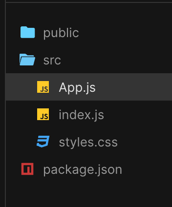
We have the public folder then we have the src folder and we have the App.js file and we have the index.js and we have the styles.css file
Creating the Pop Up Modal
Modal Wrapper : This is a modal wrapper, the function of the Modal wrapper is to dim the background page.
Modal Container: The modal container has all the modal contents like text field buttons that are in the
Modal Header and Close Button: We have the button to close the modal, some additional place to write on the header
Modal Body: Modal body would contain anything that you can write inside the content of the Modal Body
Modal Footer: Anything that you want to put in the Modal footer
Creating the App
If you need a react native chat sdk to build a in app chat application then you can consider DeadSimpleChat react native sdk
We are going create an Reusable React Modal that you can add to your project.
I am going to keep it simple so that it is easily customizable for you.
First create a new file in the src folder and name it Modal.js then
import React from 'react';

function Modal({ children, onClose }) {
  return (
    <div style={styles.overlay}>
      <div style={styles.modal}>
        {children}
        <button style={styles.closeButton} onClick={onClose}>X</button>
      </div>
    </div>
  );
}

const styles = {
  overlay: {
    position: 'fixed',
    top: 0,
    left: 0,
    right: 0,
    bottom: 0,
    backgroundColor: 'rgba(0, 0, 0, 0.7)',
    display: 'flex',
    alignItems: 'center',
    justifyContent: 'center'
  },
  modal: {
    backgroundColor: 'white',
    padding: '20px',
    borderRadius: '8px',
    position: 'relative',
    width: '80%',
    maxWidth: '500px'
  },
  closeButton: {
    position: 'absolute',
    top: '10px',
    right: '10px',
    background: 'transparent',
    border: 'none',
    fontSize: '18px',
    cursor: 'pointer'
  }
};

export default Modal;What are we doing here?
First we are importing the dependencies, here we have just one
import React from 'react';Then we are creating the modal function
function Modal (children, onClose}) {
   // some code here
}
The Modal function takes two props
children: the children prop is used to render content that is passes between the open and close tags of a component- onClose onClose is a callback funxtion that is passed down to the Modal component from the parent component
JSX
We have the user interface of the modal discribed in the JSX. like
<div style={styles.overlay}>
The overlay will conver the entire viewport, that would create a dimmed background over which our Modal will be shown. We are styling our overlay using the styles Object
This will create a blackish transparent background
<div style={styles.modal}>This is going to be the container for the Modal. We will have a white backgorund for it that will contrast nicely with the semi transparent background overlay
<Modal onClose={closeFunction}>
  <p>This is the modal's content!</p>
</Modal>
This part of the code renders the modal content on the screen
In the above example the p tag will be where the {children} is
<button style={styles.closeButton} onClick={onClose}>X</button>We have the onClick event on the close button so that when the button is clicked the onClick function will be called
Next, we have the styles button that has the styles defined inside it.
and lastly we are exporting the Modal component so that we can import in the App.js
App.js
In the app.js we are importing React and useState from react and we are also importing out Modal component from the modal.js file
import React, { useState } from 'react';
import Modal from './Modal'; // importing the Modal component
App component
then we are creating the App component
function App(){
    const [isModalopen, setModalOpen] = useState(false);
We have state variables isModalOpen and the initial value set to false. This state decides whether the Modal is visiable or not.
There is an updater function as well called setModalOpen using this function you can set the state to true or false .
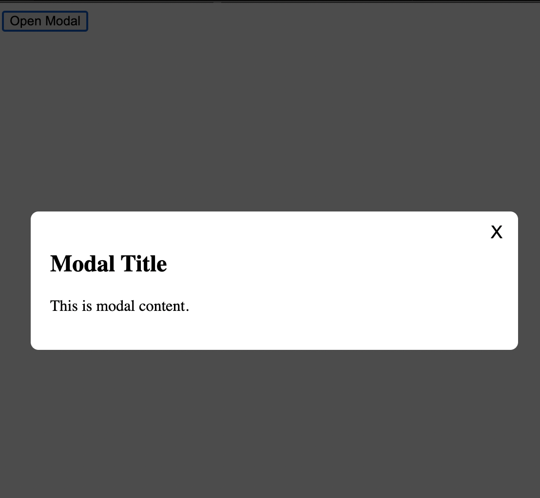
Button
<button onClick={() => setModalOpen(true)}>Open the Modal</button>We have a button with an onClick event handler that calls the setModalOpen function and passing it the value true.
Conditional Modal Rendering
{isModalOpen && (
  <Modal onClose={() => setModalOpen(false)}>
    <h2>Modal Title</h2>
    <p>This is modal content.</p>
  </Modal>
)}
If isModalOpen is set to true the code after the && will be exeuted and rendered. If isModalOpen is false then code after && is not rendered.
Inside the Modal component there we have a onClose being passed down. This function sets the isModalOpen to false and closes the Modal. Inside this we have the Modal's logic that is whatever you want to show the user inside the modal
Lastly we are exporting the App component
and that's it
This article is brought to you by DeadSimpleChat, Chat API and SDK for your website and app
You might be interested in some of our other articles
- React State Management: A Guide 2023
- Comparing Most Popular React Toast Notification Libraries
- React useRef: A complete guide with examples
- Custom Hooks: In react with examples
Conclusion
This article we discussed how we can created a reusable Modal. You can reuse the code in your project.
Ready to Add Chat to Your Website?
Get started for free. No credit card required.
Start a Free Trial
![Webinar Chat: The Complete Guide to Engaging Your Audience [2026]](/blog/content/images/size/w600/2026/02/article-hero-webinar-chat.svg)