In this article we are going to compare the top 4 Most popular react toast notifications libraries so that you can select the best one for your use. These four are
- React Toastify (1,654,802 downloads)
- Snackbar (735,356 downloads)
- Notistack (657,860 downloads)
- React-Hot-Toast (644,997 downloads)
We will look at the features and limitations and also look at some of their real world use-cases along with code examples on how to implement each one in your react application
If you are looking for a js chat sdk or a react native chat sdk for building messaging and chat applications then you can consider DeadSimpleChat React Native Chat SDK
So, to reiterate we are going to learn the following with respect to react toast libraries
- Features
- How to implement them with code example
- Limitations
- real world use-case
so let's get started
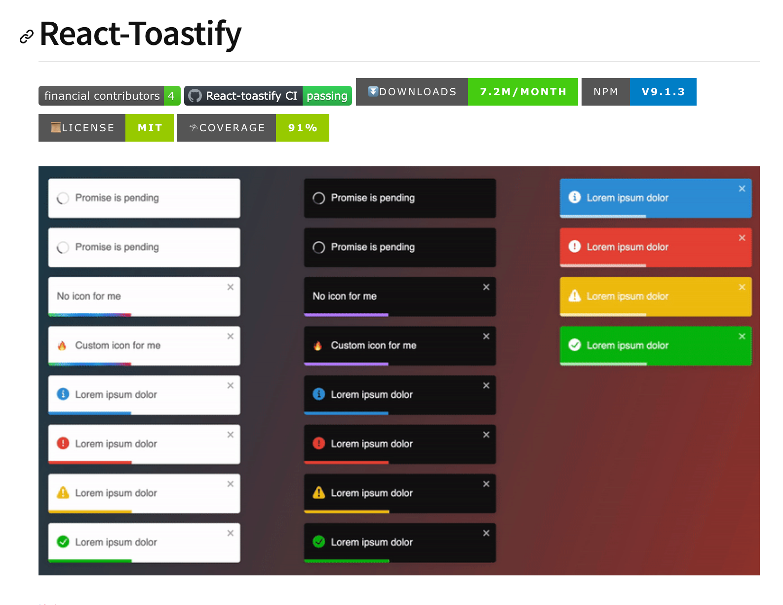
React Toastify
React toastify is the most popular react toast library out there. I have written a complete guide on how to implement react toastify in your project: React Toastify: The complete Guide
Installation
You can easily install the react toastify library in your application using npm or yarn
npm install react-toastifyor
yarn add react-toastifyCreating a basic toast notification
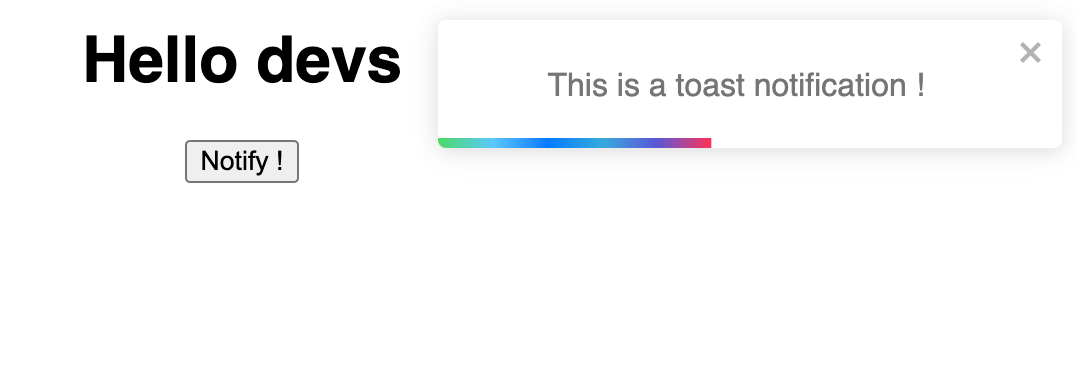
You can easily create a basic toast notification
step 1: Importing the dependencies
The first step is to import all the required dependencies including the css files like
import { ToastContainer, toast } from 'react-toastify';
import 'react-toastify/dist/ReactToastify.css';
Step 2: Add toast notification in your App.js
then in your App() function, you can create a notification
function App(){
	const notify = () => toast("This is a toast notification !");
	return (
	<div>
        <button onClick={notify}>Notify !</button>
        <ToastContainer />
      </div>
    )
}
the complete App.js looks like this:
import { ToastContainer, toast } from "react-toastify";
import "react-toastify/dist/ReactToastify.css";
import "./styles.css";

export default function App() {
  const notify = () => toast("This is a toast notification !");
  return (
    <div className="App">
      <h1>Hello developers</h1>
      <button onClick={notify}>Notify !</button>
      <ToastContainer />
    </div>
  );
}
you can see this live in the codesandbox: https://codesandbox.io/embed/old-shape-gg63c3?fontsize=14&hidenavigation=1&theme=dark
API Methods
Here are some of the API methods that are available with React toastify
- toast: function to show a toast, you have to pass a message as a string.
toast("Some toast notification");2. toast.success/toast.error/toast.info/toast.warning: These are specific functions that allow you to show success, errors etc
toast.success('Success!');
toast.error('Error occurred');
3. toast.dismiss: you can close a toast programmatically
toast.dismiss(toastId);4. toast.isActive: checks if a toast is active using the toast Id
if(toast.isActive(toastId){
   // something
   }
5. toast.update Updates a toast dynamically
toast.update(toastId, {
  type: 'success',
  autoClose: 2000,
});
Options:
- autoClose: The time in which the toast notification automatically closes is 500 ms but can be changed using this option.
- closeButton: You can create a close button inside the toast notification that closes it.
- position: You can specify where the toast notification appears on the screen with the help of the postion option
- pauseOnFocusLoss: This pauses the focus timer when the window loses the focus.
- pauseOnHover: Pause the toast from disaappear when the user has the mouse over it
- transition: Implement custom transition using the CSS transition.
Unique Features
Here are some of the Unique features of the React toastify library
- Built-in themes: React toastify has built in black and white themes to support dark mode
- Swipe to close: You can use react toastify library on mobile devices and touch enabled devices as well as it supports swipe to dismiss feature
- Progress bar: It has support for progress bar, you can implement the progress bar if you want to. Progress bar shows the time left before the toast notification is going to disappear
- Queue System: You can queque multiple toast notifications so that they come one after the another and do not overwhelm the user
- Customization: it is highly customizable and every aspect of the toast notification can be customized
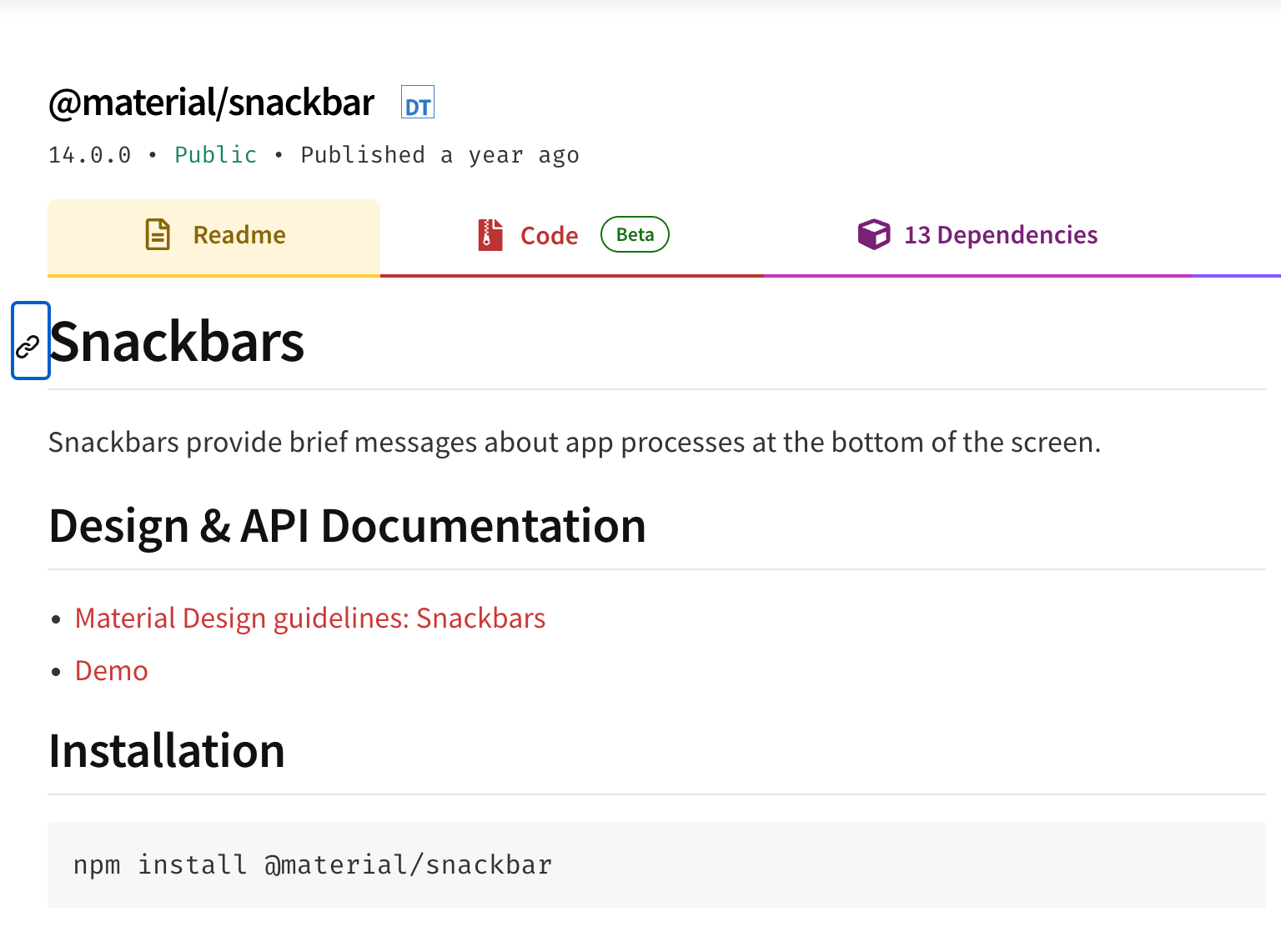
Snackbar
let us now consider another toast notification library called the Snackbar. Snackbar is based on the material UI library and has material UI design language
If you have a app with Material UI design then Snackbar will perfectly complement that app or material UI also works well with traditional design
let us look at how to install and work with Snackbar notifications
Installation
It is fairly simple to install the Snackbar in your application. First you need to install the material UI library because Snackbar is based on that
Step 1: Install the material UI
You can install the material UI like
npm install @mui/material @emotion/react @emotion/styled
Step 2: Import the Snackbar component
you can then import the Snackbar Component in your App like
import Snackbar from '@mui/material/Snackbar';Step 3: Implementing the notification
In this step we are going to implement the notification. Let us first import all the dependencies like:
import React, { useState } from "react";
import Button from "@mui/material/Button";
import Snackbar from "@mui/material/Snackbar";
import "./styles.css";
then in the App() function we are going to create state that is going to store the open and setOpen and set it to false
and using the handleClick we are going to set it to true or false
  const handleClick = () => {
    setOpen(true);
  };

  const handleClose = () => {
    setOpen(false);
  };
then we are going to return the Button component and the Snackbar component. We can set the settings for the Snackbar component as well
our code looks like :
import React, { useState } from "react";
import Button from "@mui/material/Button";
import Snackbar from "@mui/material/Snackbar";
import "./styles.css";
export default function App() {
const [open, setOpen] = useState(false);
const handleClick = () => {
setOpen(true);
};
const handleClose = () => {
setOpen(false);
};
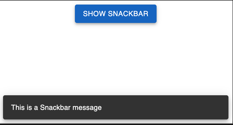
return (
<div className="App">
<Button variant="contained" color="primary" onClick={handleClick}>
Show Snackbar
</Button>
<Snackbar
open={open}
autoHideDuration={5000}
onClose={handleClose}
message="cool message from Devs"
/>
</div>
);
}
We have the working example here in the codepen: https://codesandbox.io/embed/wizardly-rui-c6pj3n?fontsize=14&hidenavigation=1&theme=dark
API Methods
enqueueSnackbar: You can use this method to display the Snackbar
const { enqueueSnackbar } = useSnackbar();
enqueueSnackbar('This is snackbar notification');
2. closeSnackbar: you can use this method to programatically close the Snackbar notification
const { closeSnackbar } = useSnackbar();
closeSnackbar(key);
Options:
- Variant: this option describes the variant type like 'default', 'success', 'error', 'warning' etc
- anchorOrigin: With this option you can specify the position of the notification on the screen
- autoHideDuration: the duration (in miliseconds) after which the notification auto closes
- action: You can render a custom action instead of a notification like a button or a link
- persist: You can keep the notification on the screen until the users closes it
- TransitionComponent: A custom react component that you can use to transition the notification. You can consider using one of the Material UI built in transitions
Features
- Material UI integration: This libraries works with Material UI and if you are using material UI in your application then this is a good fit.
- Queueing: You can queue multiple notifications in the Snackbar library.
3. Global Configuration: You can apply global settings by wrapper your components inside the SnackbarProvider.
4. Rich UI components: The Snackbar library uses the rich UI components of the Material UI including notification. designs, buttons etc
5, Accessible: It is designed to be accessible,you can follow the material design UI guidelines for accessibility
Notistack
Notistack is another library that is available. Notistack is also build on top of Material UI
let us learn how to add Notistack to our app
Installation and setup
Let us learn how to install the Notistack library and set up the toast notifications in your app
Step 1: installing the dependencies
Let us first install the material UI core in our application. You can do this like
npm install notistack @mui/material @emotion/react @emotion/styled
Step 2: Importing the Snackbar
Next step is to import the SnackbarProvider component in your application. You can do this like
import { SnackbarProvider } from 'notistack';
Step 3: Wrap the Component inside the SnackbarProvider
Now, let us wrap the component inside the SnackbarProvider so that we can use the SnackbarProvider within our component
Thus we can implement the notifications. The file looks something like this
import "./styles.css";
import React from "react";
import { SnackbarProvider } from "notistack";

export default function App() {
  return (
    <div className="App">
      <SnackbarProvider maxSnack={3}>
        <h1>Good Morning Everyone</h1>
        <h2>Start editing to see some magic happen!</h2>
      </SnackbarProvider>
    </div>
);Now that we have wrapped the Snackbar component on our App, next we can trigger the Snackbar component using the useSnackbar hook
Step 4: Trigger Snackbars notification with useSnackbar Hook
Now let us trigger the Snackbar notification on the click of a button, write the following code in your App.js
import "./styles.css";
import React from "react";
import { SnackbarProvider, useSnackbar } from "notistack";

function InnerComponent() {
  const { enqueueSnackbar } = useSnackbar();

  const handleClick = () => {
    enqueueSnackbar("I love Notistack");
  };

  return (
    <div>
      <h1>Hello CodeSandbox</h1>
      <h2>Start editing to see some magic happen!</h2>
      <button onClick={handleClick}>Show Snackbar</button>
    </div>
  );
}

export default function App() {
  return (
    <SnackbarProvider maxSnack={3}>
      <div className="App">
        <InnerComponent />
      </div>
    </SnackbarProvider>
  );
}
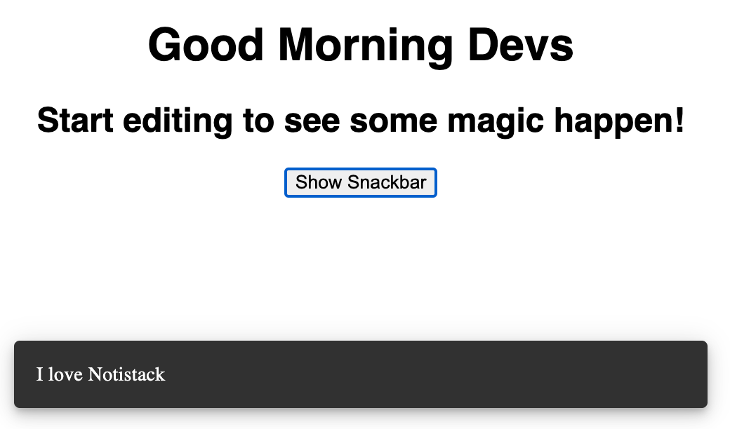
You can see the working application here: https://codesandbox.io/embed/unruffled-julien-v84wfy?fontsize=14&hidenavigation=1&theme=dark
API Methods
- enqueueSnackbar: This method is used to display the Snackbar notification
- closeSnackbar: Using this method you can programatically close the Snackbar notification
Options:
- Variant: this option describes the variant type like 'default', 'success', 'error', 'warning' etc
- anchorOrigin: With this option you can specify the position of the notification on the screen
- autoHideDuration: the duration (in miliseconds) after which the notification auto closes
- action: You can render a custom action instead of a notification like a button or a link
- persist: You can keep the notification on the screen until the users closes it
- TransitionComponent: A custom react component that you can use to transition the notification. You can consider using one of the Material UI built in transitions
Features
- Queue Mechanism: You can create a queue for the notifications with Snackbars
- Material UI compatible: Notistack uses the Material UI and hence it works good with material
- Global Configuration: You can specify global options using the
SnackbarProvider - Customizations: You can easily customize the notifications in the Notistack
React Hot Toast
In this section we are going to learn about the react Hot toast. This is a good option to integrate toast notifications into your application without compromising the style and functionality of your application
Installation and set up
you can easily install the package using the npm
npm install react-hot-toast
Step 2: Initializing the app
Next step is to initialize the library and you can do this likeby importing the library in your app.
write this code in your App.js file
import { Toaster } from 'react-hot-toast';Step 3: Add toast notification to your application
you can add toast component to your application like
function App() {
  return (
    <div className="App">
      <Toaster />
      {/* ...other components */}
    </div>
  );
}
Step 4: calling the toast notification
You can easily trigger the toast notifiation by calling the toast function, but before doing that you have to import the notification
Copy code
import toast from 'react-hot-toast';
const notify = () => {
toast('Here is your toast.');
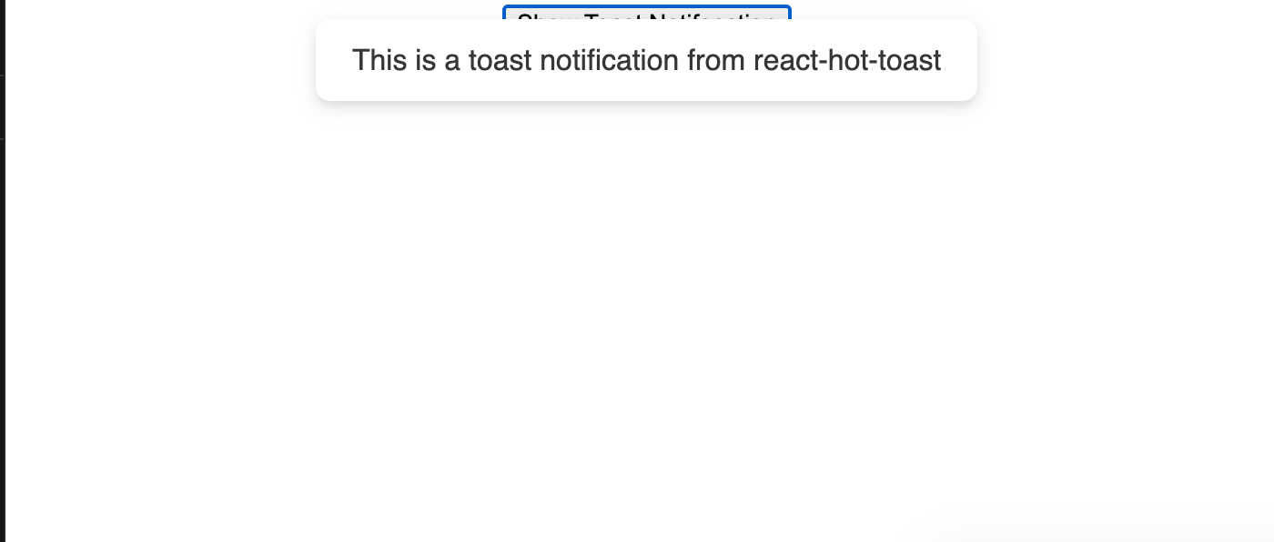
};Here is the complete example on and the code
import "./styles.css";

import React from "react";
import { Toaster } from "react-hot-toast";
import toast from "react-hot-toast";

function App() {
  const notify = () => {
    toast("This is a toast notification from react-hot-toast");
  };

  return (
    <div className="App">
      <Toaster />
      <button onClick={notify}>Show Toast Notifocation</button>
    </div>
  );
}

export default App;
API Methods
- useToasts: useToasts is a custom hook that provides methods like
addToastandremoveToastfor controlling the toasts
const { addToast, removeToast } = useToasts();
addToast('A simple toast', { appearance: 'success', autoDismiss: true });
2. withToasts: You can insert the toasts as props rather than using a hook using withToast
export default withToasts(SomeComponent);Options
- appearance: Set the type of toast like
success,error,warningetc - autoDismiss: A boolean value that determines if the toast will disappear after sometime or not. default is true
- autoDismissTimeout: Set the time in milliseconds before the toast auto disappears
- placement: You can set the placement of the toast of screen
- onDismiss: This function is called whenever a toast notification is dismissed with automatically or manually by user
Features
- Hook and HOC-based API: It has both a Hook and Higher Order Component support for flexibility
- Custom Renderers: It has support for custom toast renders
- Transition support: It has built in support for third party transitions.
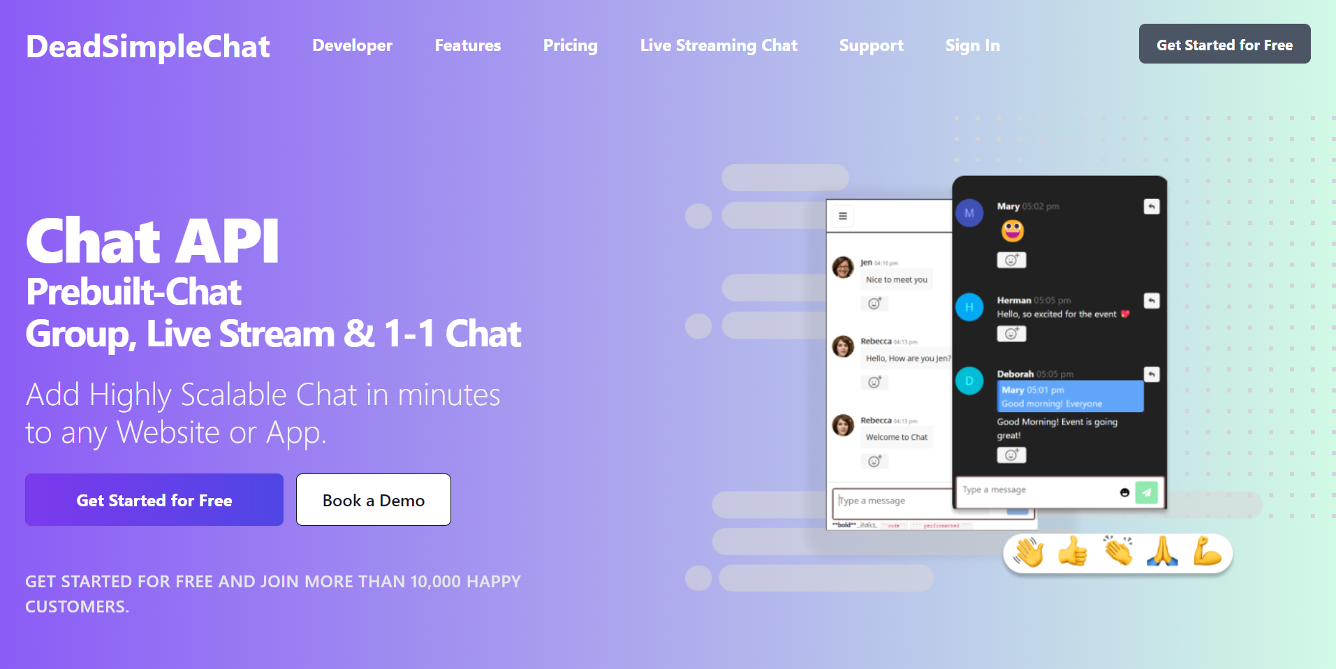
Need Chat API for your website or app
DeadSimpleChat is an Chat API provider
- Add Scalable Chat to your app in minutes
- 10 Million Online Concurrent users
- 99.999% Uptime
- Moderation features
- 1-1 Chat
- Group Chat
- Fully Customizable
- Chat API and SDK
- Pre-Built Chat
Here are some of our other articles you might be interested in
- React State Management: A Guide 2023
- Top 4 Best React Animation Libraries for 2023
- Creating A Reusable Pop-Up Modal in React from Scratch
- React Toastify: The Complete Guide
Conclusion
This article we learned about various toast notification libraries and how to implement and we also learned about the API Methods, Options and Unique features of each libraries
In hope you liked the article. Thank you for reading
Ready to Add Chat to Your Website?
Get started for free. No credit card required.
Start a Free Trial
![Webinar Chat: The Complete Guide to Engaging Your Audience [2026]](/blog/content/images/size/w600/2026/02/article-hero-webinar-chat.svg)