This guide has been updated for React Toastify v11 and React 18. from basic toast notifications to advanced patterns like promise toasts, controlled progress bars and real world use-cases
In this guide we will start with the basics for creating toast notification and step by step move on to creating complex notifications and exploring the full capabilities of the React Toastify library
Here is the run up on what we are going to learn in this article
- What are Toast Notifications?
- What is react Toastify?
- Installing react Toastify
- Creating a basic toast notification
- Types of Toast Messages
- Setting the Toast Message Position
- Custom Styling with HTML and CSS of Toast Messages
- Passing CSS classes to components
- Using transitions and animation
- Promise based Toast Messages
- Handling autoClose
- Render String, number and Component
- Setting custom icons, using built-in icons and disable icons
- Pause toast when window loses focus
- Delay toast notification
- Limit the number of toast displayed
- Implementing a controlled progress bar
- Updating a toast when an event happens
- Custom close button or Remove the close button
- Changing to different transitions
- Defining custom enter and exit animation
- Adding Undo action to toast messages
- Drag to remove
If you are looking for chat API and SDK, DeadSimpleChat is the solution for you.
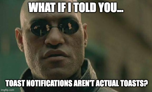
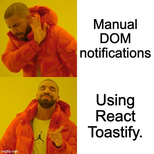
What are Toast Notifications?
Toast or Toastify notifications are pop-up messages that come up with some information generally on the side bar. This could be information like success, loading, error or caution.
There could also be a progress bar or not. there are a variety of Toast Notifications available. Refer to below images for an example:
What is react toastify?
React toastify is one of the most popular libraries out there for creating toast notification in react.
With react toastify you can easily create toast notifications and alerts in your react application
Why use React-Toastify?
- Very popular library and actively maintained with upto 2M weekly downloads
- Built-in themes, transitions, promise toasts, controlled progress bars and drag-to-dismiss
- Works well with React frameworks
Installing React Toastify
To install the react toastify, first you need a react application. You can easily add to your react application or if you are learning you can create a new react application with create-react-app
Requirements
- React 18 or the latest version is required to React-Toastify v11
Then, in your react application you can install react toastify by:
with npm:
npm install --save react-toastifywith yarn:
yarn add react-toastify
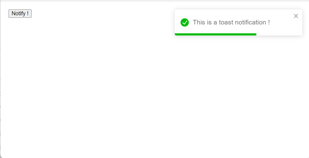
Creating a basic toast notification
Creating a basic toast notification is easy. In your App.Js file import react toastify and the react-toastify CSS like:
import { ToastContainer, toast } from 'react-toastify';
import 'react-toastify/dist/ReactToastify.css';then in your App() function just create a notification
function App(){
	const notify = () => toast("This is a toast notification !");
	return (
	<div>
        <button onClick={notify}>Notify !</button>
        <ToastContainer />
      </div>
    )
}Now, we have learned how to create basic toast notifications. Let us now learn about some of the properties of toast notifications, styling characteristics and the types of toast notifications available.
What’s new in React-Toastify v11?
React-Toastify v11 is a big release that is focused on customization, accessibility and React 18+. If you are using an older version Tostify, then below are the main changes that you should consider
No need to import the CSS file anymore
In v11 the main stylesheet is injected automatically when you render <ToastContainer />. That means:
- You do not have to import
react-toastify/dist/ReactToastify.css - You can still import the CSS file manually if you prefer, or if you have a specific SSR / bundler setup that needs it.
import { ToastContainer, toast } from "react-toastify";

function App() {
  const notify = () => toast("This is a toast notification!");

  return (
    <div>
      <button onClick={notify}>Notify!</button>
      <ToastContainer />
    </div>
  );
}
Easier customization with a simpler DOM and CSS variables
In the previous version you had to override a lot of classes to get a custom look. In V11
- The DOM structure has been made simple by removing the
Toastify__toast-body - Most of the visual tokens are exposed as CSS variables
This means that you can usually match you design simply by
- Tweaking a few CSS class variales in the
:rootand - Passing your own classes via
className,toastClassNameandprogressClassName
Accessibility improvements and keyboard shortcuts
Here are some of the accessibility improvements
ToastContainerand individualtoast()calls now acceptareaLabelprop to give your notifiations an accessible name- By default when at least one toast is visible pressing
Alt + Twill focus the first toast so users can use the keyboard. - You can customize this shortcut using
hotkeysprop withToastContainer
const matchShortcut = (e) => e.metaKey && e.key === "f"; // Cmd + F / Ctrl + F

<ToastContainer
  hotKeys={matchShortcut}
  ariaLabel="Notifications ⌘ + F"
/>;
Custom progress bars with customProgressBar
Now you can build your custom progress bar while still using the features like autoClose, pauseOnHover and pauseOnFocusLoss
You can enable this feature with the customProgressBar option and render your own component
function App() {
  const notify = () => {
    toast(CustomNotification, {
      autoClose: 8000,
      customProgressBar: true, // remove built-in bar, use your own
    });
  };

  return (
    <div>
      <button onClick={notify}>Notify</button>
      <ToastContainer />
    </div>
  );
}

// isPaused tells you when to pause animations (hover, focus loss, etc.)
function CustomNotification({ isPaused, closeToast }) {
  return (
    <div>
      <span>Hello</span>
      <MyCustomProgressBar
        isPaused={isPaused}
        onAnimationEnd={() => closeToast()}
      />
    </div>
  );
}
Smarter onClose(reason) callback
You can provide a reson to the onClose so that you know how the toast was closed
truethe user closed the toastundefinedthe toast closed automatically
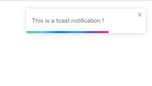
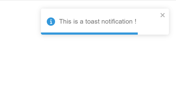
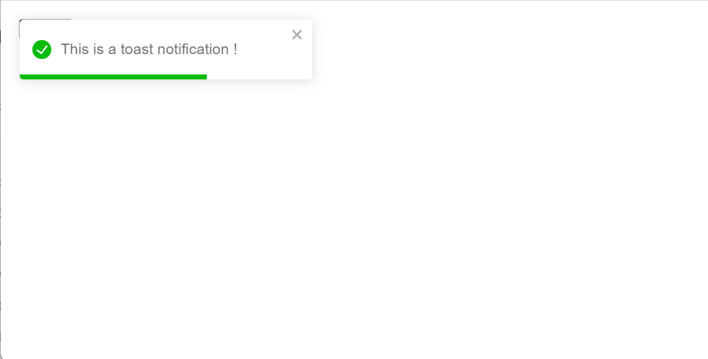
Types of toast notifications
There are 5 predefined types of toast notifications available in the react toastify
these are:
- Default
- info
- success
- warning
- error
This is how these 5 types look like and how you can implement each of the type below:
Just call the Toast Emitter with the type you want to implement
Default
const notify = () => toast("This is a toast notification !");This is the default, so no need to call anything here. The complete function looks like this:
function Toastify(){
  const notify = () => toast.error("This is a toast notification !");
  return (
    <div>
    <button onClick={notify}>Notify !</button>
    <ToastContainer />
  </div>
  )
Info
const notify = () => toast.info("This is a toast notification !");The complete function looks like
function Toastify(){
  const notify = () => toast.info("This is a toast notification !");
  return (
    <div>
    <button onClick={notify}>Notify !</button>
    <ToastContainer />
  </div>
  )
}
Success
const notify = () => toast.success("This is a toast notification !");the complete function looks
function Toastify(){
  const notify = () => toast.success("This is a toast notification !");
  return (
    <div>
    <button onClick={notify}>Notify !</button>
    <ToastContainer />
  </div>
  )
}
Warning
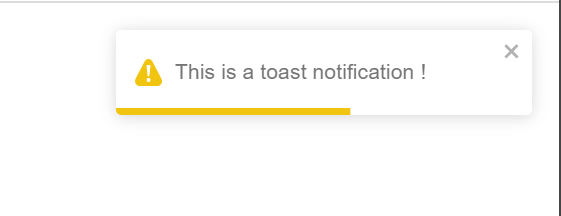
const notify = () => toast.warning("This is a toast notification !");
function Toastify(){
  const notify = () => toast.warning("This is a toast notification !");
  return (
    <div>
    <button onClick={notify}>Notify !</button>
    <ToastContainer />
  </div>
  )
}
Error
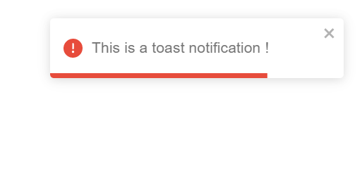
const notify = () => toast.error("This is a toast notification !");function Toastify(){
const notify = () => toast.error("This is a toast notification !");
return (
<div>
<button onClick={notify}>Notify !</button>
<ToastContainer />
</div>
)
}
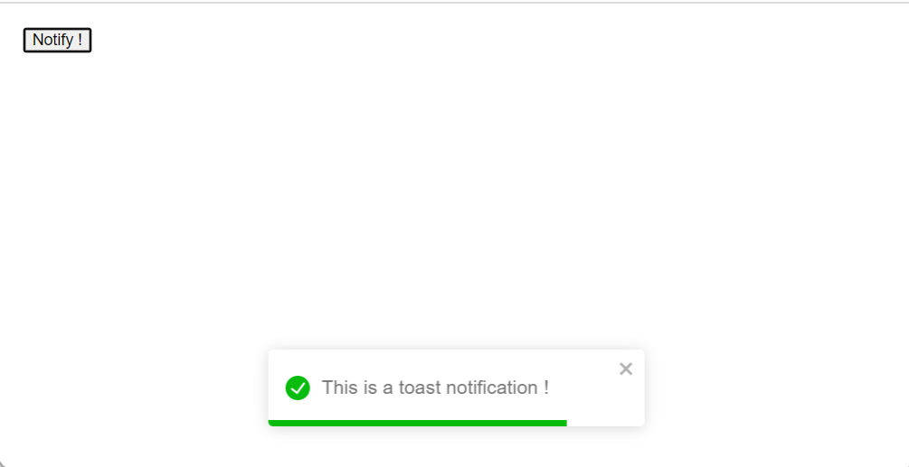
Setting the Toast Notification position
You can set the Toast notification position from a variety of pre set positions available in the react toastify library
the available positions are:
- top-left
- top-right
- top-center
- bottom-left
- bottom-right
- bottom-center
Here is how the positional notification looks like in each of the position and the code to implement the position
To add the position setting you need to edit the ToastContainer and set the position property like
<ToastContainer
position="top-right" />
In our example you can set it like
function Toastify(){
  const notify = () => toast.error("This is a toast notification !");
  return (
    <div>
    <button onClick={notify}>Notify !</button>
	    <ToastContainer
    	position="top-right"
    	/>
  </div>
  )
}
you can set other settings like so:
<ToastContainer
position="top-left"
/>

<ToastContainer
position="top-right"
/>

<ToastContainer
position="top-center"
/>

<ToastContainer
position="bottom=left"
/>

<ToastContainer
position="bottom-right"
/>

<ToastContainer
position="bottom-center"
/>The different positions look like this
top-left
top-right
top-center
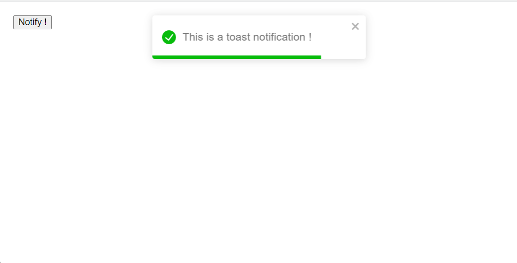
bottom left
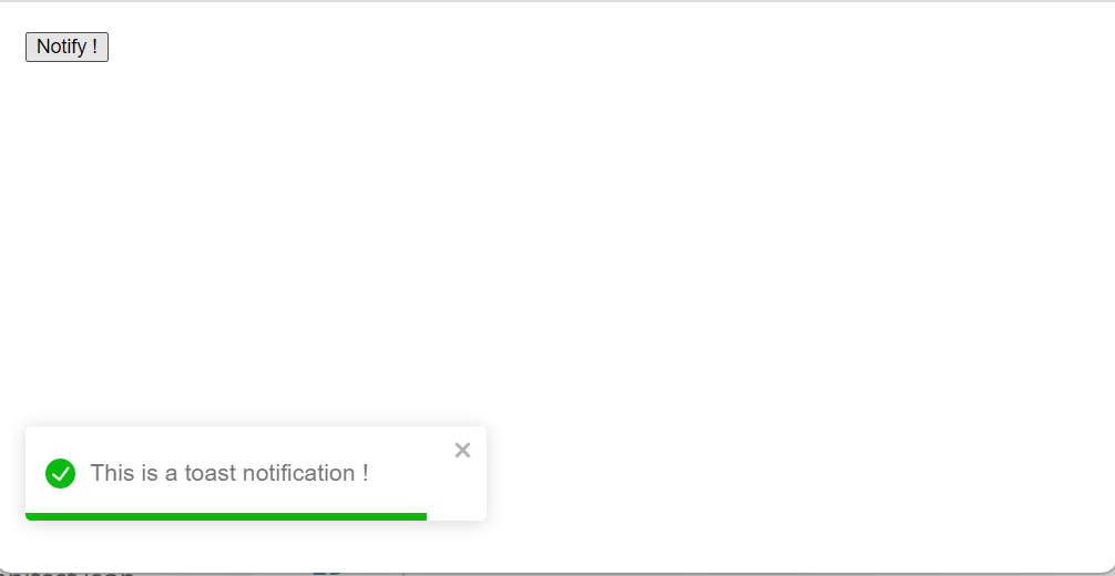
bottom-right

bottom-center
Custom Styling the notification with CSS
In version 11 you get CSS variables and a much simpler DOM.
There are bunch of CSS variables that are exposed by the react toastify library. You can override them and do customization that most will work for most people.
you can usually get what you need just by customizing a few variables or passing in your own classes without touching any of the library's internal markup
Here are the variables that you can override:
:root {
  /* Base colors */
  --toastify-color-light: #fff;
  --toastify-color-dark: #121212;
  --toastify-color-info: #3498db;
  --toastify-color-success: #07bc0c;
  --toastify-color-warning: #f1c40f;
  --toastify-color-error: #e74c3c;
  --toastify-color-transparent: rgba(255, 255, 255, 0.7);

  /* Icon + text */
  --toastify-icon-color-info: var(--toastify-color-info);
  --toastify-icon-color-success: var(--toastify-color-success);
  --toastify-icon-color-warning: var(--toastify-color-warning);
  --toastify-icon-color-error: var(--toastify-color-error);
  --toastify-text-color-light: #757575;
  --toastify-text-color-dark: #fff;

  /* Layout */
  --toastify-container-width: fit-content;
  --toastify-toast-width: 320px;
  --toastify-toast-offset: 16px;
  --toastify-toast-background: #111827;  /* your brand */
  --toastify-toast-padding: 14px;
  --toastify-toast-min-height: 64px;
  --toastify-toast-max-height: 800px;
  --toastify-toast-bd-radius: 10px;
  --toastify-toast-shadow: 0 6px 18px rgba(0, 0, 0, 0.35);
  --toastify-font-family: system-ui, -apple-system, BlinkMacSystemFont;
  --toastify-z-index: 9999;

  /* Progress bar */
  --toastify-color-progress-light: linear-gradient(
    to right,
    #4cd964,
    #5ac8fa,
    #007aff,
    #34aadc,
    #5856d6,
    #ff2d55
  );
  --toastify-color-progress-dark: #bb86fc;
  --toastify-color-progress-info: var(--toastify-color-info);
  --toastify-color-progress-success: var(--toastify-color-success);
  --toastify-color-progress-warning: var(--toastify-color-warning);
  --toastify-color-progress-error: var(--toastify-color-error);
  --toastify-color-progress-bgo: 0.2; /* trail opacity */
}
If changing variables is not enough for you. You can override existing class. Here are the classes that you can easily override
/* Container behavior & positions */
.Toastify__toast-container { }
.Toastify__toast-container--top-left { }
.Toastify__toast-container--top-center { }
.Toastify__toast-container--top-right { }
.Toastify__toast-container--bottom-left { }
.Toastify__toast-container--bottom-center { }
.Toastify__toast-container--bottom-right { }

/* Toast wrapper */
.Toastify__toast { }
.Toastify__toast--rtl { }

/* Icon + theme */
.Toastify__toast-icon { }
.Toastify__toast-theme--light { }
.Toastify__toast-theme--dark { }
.Toastify__toast-theme--colored.Toastify__toast--success { }
/* ...info, warning, error, default... */

/* Progress bar */
.Toastify__progress-bar { }
.Toastify__progress-bar--success { }
/* ...other types... */

/* Close button */
.Toastify__close-button { }
.Toastify__close-button--default { }
you can also build your own style using the scss file. Just edit the scss directory and build your own stylesheet.
If you just want to change some colors and stuff like that you can easily do that by changing some variables
Passing CSS classes to components
The ToastContainer will accept the following props for styling,
- className
- toastClassName
- bodyClassName
- progressClassName
- style
toast("Custom style", {
  className: "black-background",
  bodyClassName: "grow-font-size",
  progressClassName: "fancy-progress-bar",
});This is how you can customize the toast notification
Using transitions and animation
When it comes to animation there are millions of ways you can animate the toast notification.
m and of course you can create your custom animations as well
The four available transitions are:
- bounce
- slide
- zoom
- flip
You can use one of the default transitions like
to add a default transition import the transitions from react-toastify and then in the ToastContainer add the transition like shown above.
You can also implement the transition per toast as well, so you can have different transition for different toasts
Instead of the ToastContainer add the transition setting in the toast function
import { Bounce, Slide, Zoom, ToastContainer, toast } from 'react-toastify';
  const notify = () => toast.success("This is a toast notification !");

<ToastContainer
    transition={Zoom}
    />
</div>function Toastify(){
const notify = () => toast.success("This is a toast notification !",{
transition: Slide
});
return (
<div>
<button onClick={notify}>Notify !</button>
<ToastContainer
/>
</div>
)
}For custom transition, create the custom transition and import it in your App.js file then in the ToastContainer or the toast function use it as you use the default transition. like
import { Bounce, Slide, Zoom, ToastContainer, toast } from 'react-toastify';
  const notify = () => toast.success("This is a toast notification !");

<ToastContainer
    transition={yourCustomTransition}
    />
  </div>
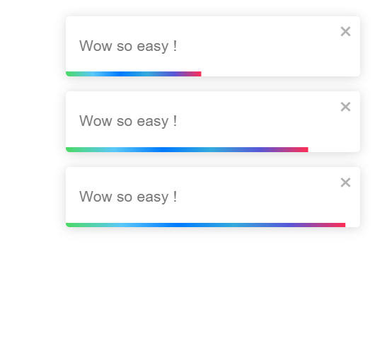
Promise based Toast Messages
The react toasitfy exposes a toast.promise function. You can add a promise or a function that returns a promise.
When that promise is resolved or fails the notification will be updated accordingly.
When the promise is pending a notification spinner is also displayed
function Toastify(){

  const resolveAfter2Seconds = new Promise(resolve => setTimeout(resolve, 2000))
  const notify = () => toast.promise(resolveAfter2Seconds, {
    pending: "waiting for the promise to resolve",
    success: "promise resolved successfully",
    error: "promise failed to resolve"
  });

  return (
    <div>

    <button onClick={notify}>Notify !</button>

    <ToastContainer
    />
  </div>
  )
}This is how you can create a promise based toast message.
Displaying a simple message is useful in most of the cases. For added interactivity you can display a message according to the promise response.
You can show some message if the promise resolves successfully or show some other message if the promise fails to resolve and even show a message when the promise is pending.
Here is how you can implement this:
function Toastify(){

  const notify = new Promise(resolve => setTimeout(() => resolve("this is soo cool"), 2000));
toast.promise(
    notify,
    {
      pending: {
        render(){
          return "Promise Pending"
        },
        icon: false,
      },
      success: {
        render({data}){
          return `Great, ${data}`
        },
        // other options
        icon: "👍",
      },
      error: {
        render({data}){
          // When the promise reject, data will contains the error
          return <MyErrorComponent message={data.message} />
        }
      }
    }
)
  return (
    <div>

    <button onClick={notify}>Notify !</button>

    <ToastContainer
    />
  </div>
  )
}
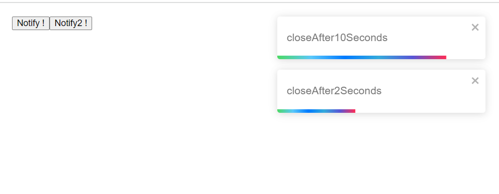
Handling Auto Close
The autoClose property of the toast accepts a duration in miliseconds or false
import { ToastContainer, toast } from 'react-toastify';

//Close the toast after 2 seconds
    <ToastContainer
    autoClose={2000}
    />
You can also individually close each toast at different points in time
function Toastify(){


  const notify = () => toast("closeAfter10Seconds", {
  autoClose: 10000
  });

  const notify2 = () => toast("closeAfter2Seconds", {
    autoClose: 2000
    });

  return (
    <div>

    <button onClick={notify} >Notify !</button>
    <button onClick={notify2} >Notify2 !</button>

    <ToastContainer
    autoClose={2000}
    />
  </div>
  )
}
You can also prevent the toast notification from closing by default using the false statement instead of the seconds like
toast("hi",
	{
    autoClose: false
});Render String, number and Component
You can render any react node including a String, number or even a component. This is how you can do it
import React from "react";
import { ToastContainer, toast } from 'react-toastify';

const Data = ({closeToast, toastProps})=>{
  <div>
  Hi how are you?
  {toastProps.position}
  <button>Retry</button>
  <button onClick={closeToast}>close</button>

</div>
}

function Toastify(){


  const notify = () => toast(
    <Data />
  );

  return (
    <div>

    <button onClick={notify} >Notify !</button>

    <ToastContainer
    />
  </div>
  )
}Setting custom icons, using built-in icons and disable
There are built in icons available with the toastify library that are useful for most cases, you can include customize icons for your application and lastly you can delete the icons from the toast notification itself as well.
The toast types all display their associated icons, so you can specify a toast type and display the corresponding icon
Custom Icon
to display a custom icon simply supply the toast type with an icon liike so
//you can use a string
toast.success("custom toast icons". {
              icon: "👍"
});

//or a component
toast.success("custom toast icons". {
              icon: CustomIcon
});
// or a function
toast.success("custom toast icons". {
              icon: ({theme,type}) => <img src="url"/>
});
Pause toast when window loses focus
The default behaviour of the toast is to pause whenever the window loses focus. But you can set it to not pause by setting the pauseOnFocusLoss property to false like
//All all toasts
<ToastContainer pauseOnFocusLoss={false} />

// for individual toasts
toast('cool', {
  pauseOnFocusLoss: false
})Delay toast notification
To delay notification display you can use setTimeout or use the delay prop that uses setTimeout under the hood
toast('cool')
toast('how are you?', {delay: 1000});Limit the number of toast displayed
Notification can be handy, but there can be multiple number of notification displayed.
You can limit the number of notifications displayed using the limit prop
import React from 'react';
import { toast, ToastContainer } from 'react-toastify';

import 'react-toastify/dist/ReactToastify.css';

// Display a maximum of 3 notifications at the same time
function App(){
  const notify = () => {
    toast("lorem ipsum");
  }

  return (
    <div>
      <button onClick={notify}>Click on me a lot!</button>
      <ToastContainer limit={3}>
    </div>
  )
}
When the number of toasts displayed hits the limit the remaining toasts are added to a queue and then displayed whenever a slot is available
You can clear the queue as well, to clear the queue so that no more toasts are displayed use the clearWaitingQueue() method
toast.clearWaitingQueue();
Implementing a controlled progress bar
If you are programming a file upload or something else where you need to indicate the progress of the program then a controlled progress bar that indicates that process might come useful
Lets see an example where we upload file to the server and the progress bar will load as the file is being uploaded
import React from 'react';
import axios from 'axios';
import { toast } from 'react-toastify';

function demoOfProgressBar(){
  // Keeping a reference of the toast id
  const toastId = React.useRef(null);

  function uploadFiles(){
    axios.request({
      method: "post",
      url: "/cool",
      data: informationToBeUploaded,
      onUploadProgress: p => {
        const progress = p.loaded / p.total;

        // see if the toast is being displayed
        if (toastId.current === null) {
          toastId.current = toast('Uploading', { progress });
        } else {
          toast.update(toastId.current, { progress });
        }
      }
    }).then(data => {
      //When the upload is done the progress bar will close and the transition will end
      toast.done(toastId.current);
    })
  }

  return (
    <div>
      <button onClick={uploadFiles}>Upload files to server</button>
    </div>
  )
}
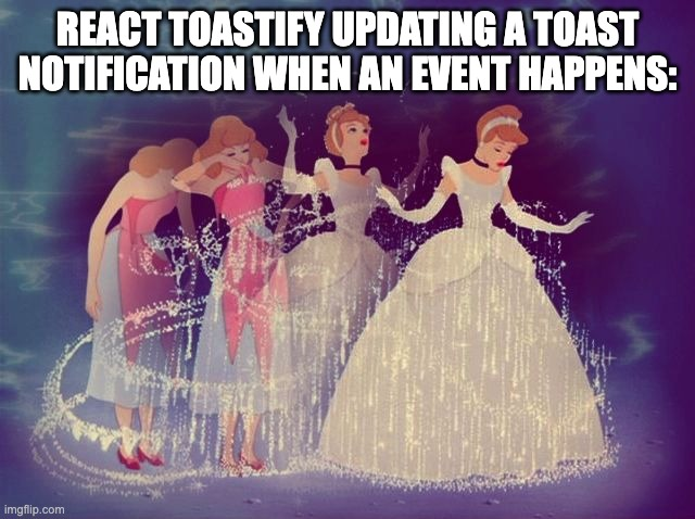
Updating a toast when an event happens
You can update a toast when an event happens, For example if you are uploading a file to the server, you can update the toast when the upload is completed
Things you can update
- Change the Type of toast or change colors or theme
- Change the content of the toast
- Apply a transition when the change happens
Lets see these with examples in action
1. Change the Type of toast or change colors or theme
import React from 'react';
import { toast } from 'react-toastify';

function changeToast() {
  const toastId = React.useRef(null);

  const notify = () => toastId.current = toast("this is soo cool", { autoClose: false });

  const updateToast = () => toast.update(toastId.current, { type: toast.TYPE.INFO, autoClose: 2000 });

  return (
    <div>
      <button onClick={notify}>Notify</button>
      <button onClick={updateToast}>Update</button>
    </div>
  );
}2. Change the content of the toast
Changing the content of the toast is easy as well. Just pass any valid element or even a react component.
In the below examples I will show how to render a string as well as component to change the toast in action
 // With a string
 toast.update(toastId, {
    render: "New content",
    type: toast.TYPE.INFO,
    autoClose: 5000
  });

// Or with a component
toast.update(toastId, {
    render: MyComponent
    type: toast.TYPE.INFO,
    autoClose: 5000
});

toast.update(toastId, {
    render: () => <div>New content</div>
    type: toast.TYPE.INFO,
    autoClose: 5000
});3. Apply a transition when the change happens
If you want to apply a transition when a change happens thenyou can use the className or the transition property to achieve this
toast.update(toastId, {
  render: "stuff",
  type: toast.TYPE.INFO,
  transition: Zoom
})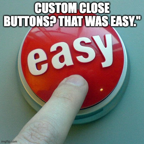
Custom close button or Remove the close button
You can pass the a custom close button to the toast container and override the default button
Here is how you can do this.
  import React from 'react';
  import { toast, ToastContainer } from 'react-toastify';

  const CloseButton = ({ closeToast }) => (
    <i
      className="fastly-buttons"
      onClick={closeToast}
    >
    delete
    </i>
  );

function App() {
  const notify = () => {
    toast("this is a toast notification");
  };

  return (
    <div>
      <button onClick={notify}>Notify</button>;
      <ToastContainer closeButton={CloseButton} />
    </div>
  );
}
Here is how you can define it per toast
toast("this is a toast notification", {
  closeButton: CloseButton
})You can also remove it globally and show it per toast or show it globally and hide it per toast like:
toast("this is a toast notification", {
  closeButton: true
})

//hide it per toast and show globally
toast("this is a toast notification", {
  closeButton: false
})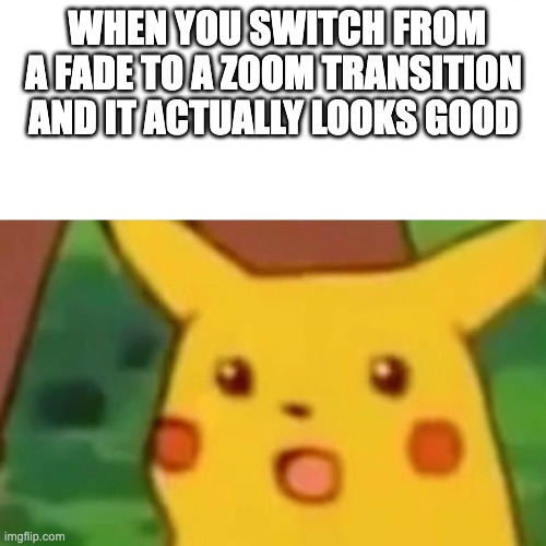
Changing to different transitions
React toastify comes with a bunch of predefined transitions that can be applied to toast notifications
These transitions determines how the toast notifications enter and exit the screen
here are the inbuilt transitions that react toastify offers
- Bounce: There is a bounce effect when toast enter and exit the screen
- Slide: Toasts slide into the screen and slide out of the screen
- Zoom: The toasts zoom into the screen and zoom out of the screen
- Flip: Toasts flip into the screen and flip out of the screen
import { toast, Slide, Zoom, Flip, Bounce } from 'react-toastify';

// Using the Zoom transition
toast('We are using zoom transition in this toast!', {
    transition: Zoom
});

// Using the Slide transition
toast.info('We are using slide transition in this toast!', {
    transition: Slide
});
Defining custom enter and exit animation
If you need even more customization for the enter and exit animation, you can define the custom transition using CSS transitions and animations
you can create a CSS transition and then apply it your toast notifications
Here is the step by step guide
- Define the CSS Animation that you want to implement
you need to define the @Keyframes in your CSS and your styled components like so
@keyframes customEnter {
  from {
    transform: translate3d(100%, 0, 0);
    visibility: visible;
  }
  to {
    transform: translate3d(0, 0, 0);
  }
}

@keyframes customExit {
  from {
    transform: translate3d(0, 0, 0);
  }
  to {
    transform: translate3d(100%, 0, 0);
    visibility: hidden;
  }
}
2. Next you need to create a Custom transition component. You can use the cssTransition helper from React toastify
import { cssTransition } from 'react-toastify';

const CustomTransition = cssTransition({
  enter: 'customEnter',
  exit: 'customExit',
  duration: [500, 800], // Duration for enter and exit transitions in milliseconds
  appendPosition: false  // Whether to append the position class names (`top-left`, `bottom-right`, etc.)
});
3. Apply the custom transition:
Use the custom transition in your toast notification
toast('This is a custom transition that I have created!', {
    transition: CustomTransition
});
Adding Undo action to toast messages
You can add a undo button to the toast messages. For example if some one did a action that they want to undo they can easily undo the action by clicking on the undo button

Drag to remove
you can drag the toast to remove it. You need to define the width percentage to remove the toast. You can also disable drag to remove.
set the percentage of drag when the toast is removed
pass the draggablePercent props with the percentage of screen that needs to be dragged to remove the toast as follows
<ToastContainer draggablePercent={50} />toast('Cool',{
draggablePercent: 90
})To disable the ability to drag to dismiss pass the false to draggable property
<ToastContainer draggable={false} />You can disable per toast notification as follows
toast('Cool',{
    draggable: false
})
Here is how you can enable drag to remove in react Toastify notification.
Deploy Kubernetes Load Balancers ON-Premise, just Like the Cloud!
Effortlessly assign external IPs to your on-prem services with EdgeLB.
You might be interested in some of our other articles
Metered TURN servers
- Global Geo-Location targeting: Automatically directs traffic to the nearest servers, for lowest possible latency and highest quality performance. less than 50 ms latency anywhere around the world
- Servers in 12 Regions of the world: Toronto, Miami, San Francisco, Amsterdam, London, Frankfurt, Bangalore, Singapore,Sydney (Coming Soon: South Korea, Japan and Oman)
- Low Latency: less than 50 ms latency, anywhere across the world.
- Cost-Effective: pay-as-you-go pricing with bandwidth and volume discounts available.
- Easy Administration: Get usage logs, emails when accounts reach threshold limits, billing records and email and phone support.
- Standards Compliant: Conforms to RFCs 5389, 5769, 5780, 5766, 6062, 6156, 5245, 5768, 6336, 6544, 5928 over UDP, TCP, TLS, and DTLS.
- Multi‑Tenancy: Create multiple credentials and separate the usage by customer, or different apps. Get Usage logs, billing records and threshold alerts.
- Enterprise Reliability: 99.999% Uptime with SLA.
- Enterprise Scale: With no limit on concurrent traffic or total traffic. Metered TURN Servers provide Enterprise Scalability
- 50 GB/mo Free: Get 50 GB every month free TURN server usage with the Free Plan
- Runs on port 80 and 443
- Support TURNS + SSL to allow connections through deep packet inspection firewalls.
- Support STUN
- Supports both TCP and UDP
Ready to Add Chat to Your Website?
Get started for free. No credit card required.
Start a Free Trial
![Webinar Chat: The Complete Guide to Engaging Your Audience [2026]](/blog/content/images/size/w600/2026/02/article-hero-webinar-chat.svg)