In this article we are going to learn about how to make a slider in react using the rc-slider library
In this article we will cover installation and setup, creating a basic slider, advanced use-cases and different types of sliders you can create with detailed examples
This article is structed in such as way that you can read what you need. If you just need to create a basic slider read that part, if you want to create a vertical slider you can read that section. If you want to learn how to integrate the slider data with your application you can read that
Dead Simple Chat allows you to add chat in minutes to your React Application with the powerful JavaScript Chat SDK and API.
Pre-requisites
React-slider is a easy to understand library. There are a few basic things you should know though
- Basic knowledge of react and javascript
- Node.js installed on your computer
Installation and setup
Create a demo project on your computer with the create react app and name it react-slider-demo
then open the folder in your favorite text editor I am using visual studio code. Then install the react-slider library by typing the below code in your terminal
npm install rc-slider --saveDead Simple Chat allows you to add chat in minutes to your React Application with the powerful JavaScript Chat SDK and API.
Creating a basic React Slider
Now let us get started with coding
Open the App.js file and import the react-slider library there and add the below code
import "./styles.css";
import Slider from "rc-slider";
import "rc-slider/assets/index.css";

export default function App() {
  return (
    <div className="App">
      <h1>React Slider demo</h1>
      <Slider />
    </div>
  );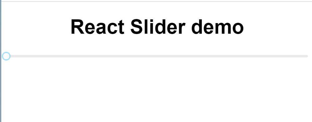
}In this file we are importing the rc-slider and css file for the rc-slider
Then we have pasted the Sider element below the h1 tag and you can see that we have created a basic slider
The default slider looks like this:
Dead Simple Chat allows you to add chat in minutes to your React Application with the powerful JavaScript Chat SDK and API.
Enhancing the look of the slider
Now, that we have build a simple slider component. let us style it and make it look good. The rc-slider has 3 main props that can be used to customize the slider
- handleStyle: style the handle of the slider
- trackStyle: Style the track of the slider
- railStyle : The style used for track base color
We have other style properties as well. for specific use cases
- dotStyle: the style used for dots
- activeDotStyle: the style used for active dots
here is an example:
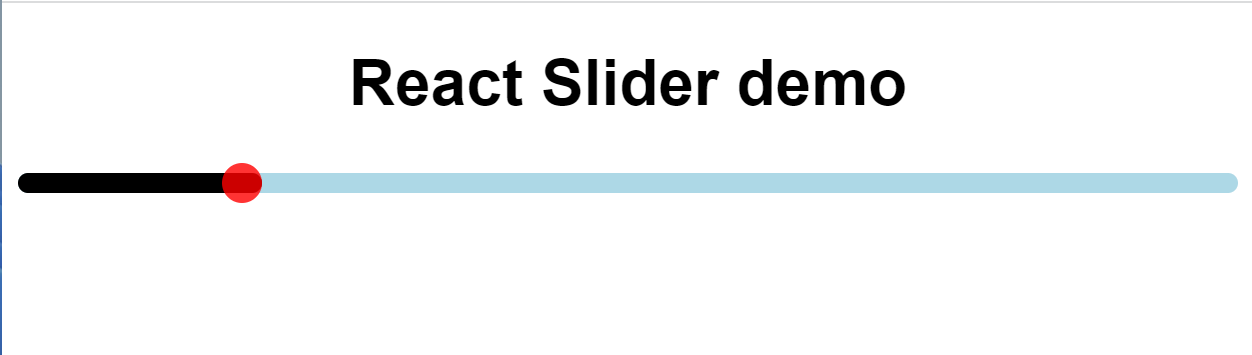
We have changed the track color to black and the handle color to red using the handleStyle and the TrackStyle properties
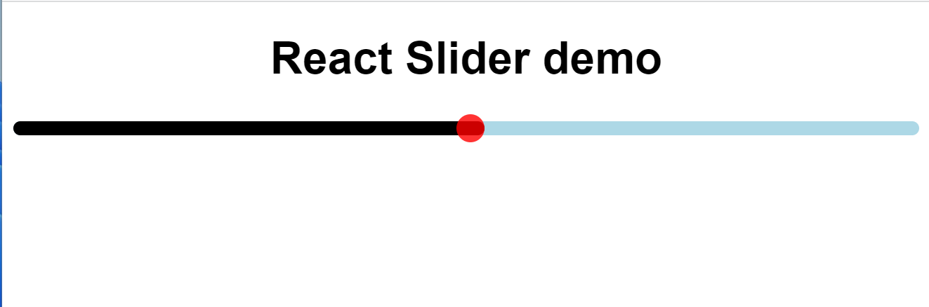
Here is what the code looks like:
import "./styles.css";
import Slider from "rc-slider";
import "rc-slider/assets/index.css";

export default function App() {
  return (
    <div className="App">
      <h1>React Slider demo</h1>
      <Slider
        trackStyle={{ backgroundColor: "black", height: 10 }}
        railStyle={{ backgroundColor: "lightblue", height: 10 }}
        handleStyle={{
          borderColor: "red",
          height: 20,
          width: 20,
          marginLeft: -10,
          marginTop: -5,
          backgroundColor: "red"
        }}
      />
    </div>
  );
}
Dead Simple Chat allows you to add chat in minutes to your React Application with the powerful JavaScript Chat SDK and API.
Setting Values to the Slider
Let us set some values to the Slider. You can set the values to the slider using the props like
- defaultValue
- min
- max
Let us improve our example above to add values to it
import "./styles.css";
import Slider from "rc-slider";
import "rc-slider/assets/index.css";

export default function App() {
  return (
    <div className="App">
      <h1>React Slider demo</h1>
      <Slider
        defaultValue={20}
        min={0}
        max={100}

        trackStyle={{ backgroundColor: "black", height: 10 }}
        railStyle={{ backgroundColor: "lightblue", height: 10 }}
        handleStyle={{
          borderColor: "red",
          height: 20,
          width: 20,
          marginLeft: -10,
          marginTop: -5,
          backgroundColor: "red"
        }}
      />
    </div>
  );
}
As you can see we added the values to the slider and set the default value at 20. Now when you load the page the value is set to 20
You can set any value you want to set as a default value the position of the sliderHandle will be in respect to the values of defaultValue and min, max properties
Dead Simple Chat allows you to add chat in minutes to your React Application with the powerful JavaScript Chat SDK and API.
Tracing changes with onBeforechage, onChange and onAfterChange Event
Let us learn more about the event OnBeforeChange, OnChange and OnAfterChange and how these events can benefit us in our application
OnBeforeChange event is triggered just before the user starts to interact with the sidebar. When the user clicks on the sidebar to interact with it this event is triggered
OnBeforeChange event can be useful in setting up the slider or validating the conditions before letting the user slide the slider
Next, let us look at OnAfterChange method. This method is triggered when the user stops interacting with the Slider. When the user releases the sidebar handle this event is triggered
OnAfterChange method can be used to do some clean up or finalization after the user has stopped interacting with the slider
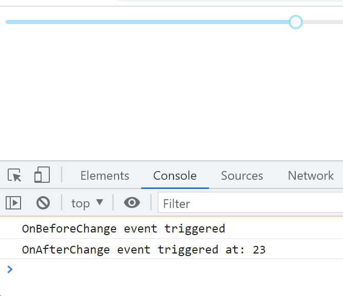
Here is an example of both OnBeforeChange and OnAfterChange method being triggered
import React from "react";
import Slider from "rc-slider";
import "rc-slider/assets/index.css";

function App() {
  const didOnBeforeChangeTrigger = () => {
    console.log("OnBeforeChange event triggered");
  };

  const didOnAfterChangeTrigger = (value) => {
    console.log(`OnAfterChange event triggered at: ${value}`);
  };

  return (
    <div className="App">
      <Slider
        defaultValue={20}
        onBeforeChange={didOnBeforeChangeTrigger}
        onAfterChange={didOnAfterChangeTrigger}
      />
    </div>
  );
}

export default App;What are we doing here
We have the OnBeforeChange and the OnAfterChange props in the Slider component.
The OnBeforeChange and OnAfterChange calls the didOnBeforeChangeTrigger and didOnAfterChangeTrigger methods respectively when the OnBeforeChange or OnAfterChange events happen
the didOnBeforeChangeTrigger and didOnAfterChangeTrigger logs a message to the console here is what the message looks like
Now that we have learnt about the OnBeforeChange and the OnAfterChange events let is learn about the OnChange event
OnChangeEvent is triggered when the user is sliding the slider. The OnChange event is useful in updating the value of the slider as the user is sliding it
let us look at an example to better understand this:
import React, { useState } from "react";
import Slider from "rc-slider";
import "rc-slider/assets/index.css";
function App() {
  const [value, setValue] = useState(20);

  const OnChangeEventTriggerd = (newValue) => {
    console.log("new Value", newValue);
    setValue(newValue);
  };

  return (
    <div className="App">
      <Slider value={value} onChange={OnChangeEventTriggerd} />
    </div>
  );
}

export default App;
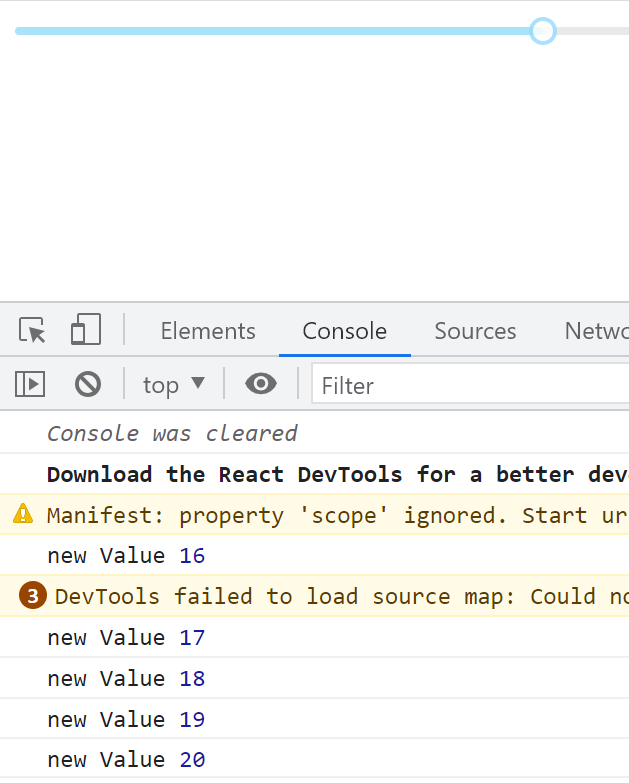
What are we doing in this example. We have an onChangeEventTriggered function that takes newValue and sets the value to the newValue
When the user is sliding the slider the OnChange event is triggered and it calls the OnChangeEventTriggered function with the newValue property and the OnChangeEventTriggered updates the value with the newValue which gets updated and logged to the console
This is how the browser console looks like
Dead Simple Chat allows you to add chat in minutes to your React Application with the powerful JavaScript Chat SDK and API.
Adding Steps
We can easily add steps in the slider using the rc-react library. We need to add the step prop and give it number along with the min and max props.
Step must be a positive number and within the min max range declared
Let us learn more about adding steps using an example
import React, { useState } from "react";
import Slider from "rc-slider";
import "rc-slider/assets/index.css";
function App() {
  const [value, setValue] = useState(20);

  const OnChangeEventTriggerd = (newValue) => {
    console.log("new Value", newValue);
    setValue(newValue);
  };

  return (
    <div className="App">
      <Slider
        value={value}
        onChange={OnChangeEventTriggerd}
        step={10}
        min={0}
        max={100}
      />
    </div>
  );
}

export default App;What are we doing here
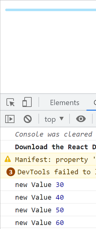
In the Slider component we have declared the step counter and we have also declared the min and max values of 0, and 100 respectively
We are using the onChange event to keep track of where the slider is. Now, as the user moves the slider, the user can do this in the multiples of 10 only
We are console logging the slider movement to keep track of this.
Dead Simple Chat allows you to add chat in minutes to your React Application with the powerful JavaScript Chat SDK and API.
Advantages of the react rc-slider library
- Easy to Customize
- Accessibility Support
- Mobile useability
- Lightweight Library
- Extensible
- Easy to customize
rc-slider is an easy to customize library. It has many porps and customization can also be done through changes in the CSS itself.
Creating Vertical slider or reversing sliders, customization of Colors and postioning with very easy with the react rc-slider library
2. Accessibility support
rc-slider is accessibility centered and works with screen readers and all kinds of devices that are helpful to the users with disabilities.
3. Mobile Useability
rc-slider library has touch support and can easily be used on mobile devices and touch screen devices
Thus it can be used in mobile devices such as an apple iPhone or an Android phone. The library also works with touch screen devices such as an iPad or an Android tablet
4. Lightweight
The react rc-library is extremely lightweight with small bundle size and no large scale external dependencies
Thus react rc-slider is a good library to consider for your web and mobile projects
5. Extensible
The react rc-slider library is extremely extensible and has support for creating tooltips and other functionality
Dead Simple Chat allows you to add chat in minutes to your React Application with the powerful JavaScript Chat SDK and API.
You might be interested in some of our other articles
- Top 4 Best React Animation Libraries for 2023
- React useRef: A complete guide with examples
- React useState: The Complete guide
- React useReducer and Reducer: Guide with Examples
Conclusion
In this article we learnt a great deal about the react rc-library. React rc-library is an good library for creating sliders and ranges.
We started with Pre-requisites, installation and setup. Then we created a basic slider implementation then we learnt about enhancing the look of the slider and then about setting values to the slider
We also learnt about the various events and how they are helpful. Lastly we learnt about the advantages of the react rc-library
I hope this article was helpful
Thanks for reading
Ready to Add Chat to Your Website?
Get started for free. No credit card required.
Start a Free Trial
![Webinar Chat: The Complete Guide to Engaging Your Audience [2026]](/blog/content/images/size/w600/2026/02/article-hero-webinar-chat.svg)