Appearance Reference
Every colour, font and size in a chat room is set on one page: open the Dead Simple Chat dashboard, go to Chat Rooms, click a room, and open the Customize tab.
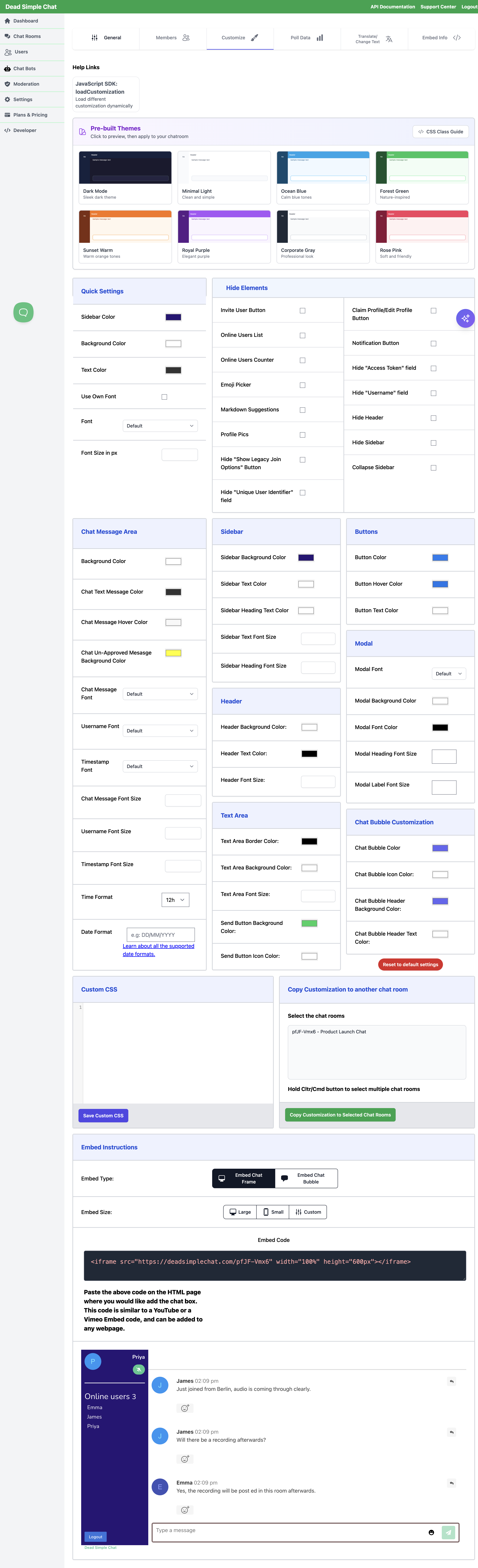
This page is the full field list, grouped exactly as the Customize tab groups it. For each field you
get what it changes, the value it takes, and the loadCustomization key that sets the same thing
from the JavaScript SDK.
How the tab behaves
Changes save themselves. There is no Save button for appearance fields. About a second after you stop editing a field, the change is written to the room and the live preview reloads. The one exception is the Custom CSS box, which has its own Save Custom CSS button.
Quick Settings is a shortcut, not a separate setting. Three of the Quick Settings fields fan out into the detailed fields below them the moment you change them:
| Quick Settings field | Also writes |
|---|---|
| Background Color | Header Background Color, Modal Background Color |
| Text Color | Sidebar Text Color, Chat Text Message Color, Modal Font Color, Header Text Color |
| Font | Chat Message Font, Username Font, Timestamp Font, Modal Font |
Set Quick Settings first to get a whole room into roughly the right palette, then adjust individual fields. Going the other way round loses your detailed work.
This fan-out is a convenience in the dashboard only. loadCustomization applies exactly the keys you
pass it and nothing else, so from the SDK set the specific keys you want — chatMessageColor,
headerTextColor and so on — rather than relying on textColor or backgroundColor to reach them.
Two more shortcuts sit at the top of the tab. Pre-built Themes previews a complete colour set and applies it to every matching field when you click Apply Theme, and the AI Configuration Assistant can set these fields from a plain description of what you want. At the bottom, Copy Customization to another chat room pushes the whole set to other rooms you own, and Reset to default settings returns the room to stock.
Value formats
These apply throughout the tab.
| Kind of field | In the dashboard | In loadCustomization |
|---|---|---|
| Colour | A colour picker, so a hex value such as #1a1a2e | A string holding any CSS colour — "#1a1a2e", "rgba(99,102,241,1)", "tomato" |
| Size | A number box, whole numbers 1 to 100, read as pixels | A string holding a CSS font-size, including the unit — "14px" |
| Font | A dropdown of bundled web fonts, or a free-text box when Use Own Font is on | A string holding the font-family name — "Nunito" |
| Toggle | A checkbox | A boolean |
Sizes are the one place the two surfaces differ in shape. The dashboard box takes a bare number
because it is labelled in pixels; the SDK key is passed through to CSS as you wrote it, so include
px when you call it from code:
frame1.loadCustomization({
  backgroundColor: "#1a1a2e",
  chatMessageColor: "#e0e0e0",
  fontSize: "14px",
  chatMessageFont: "Nunito"
});
Every field at a glance
| Field | Panel | loadCustomization key |
|---|---|---|
| Sidebar Color / Sidebar Background Color | Quick Settings, Sidebar | sidebarColor |
| Background Color | Quick Settings, Chat Message Area | backgroundColor |
| Text Color | Quick Settings | textColor |
| Use Own Font | Quick Settings | useCustomFont |
| Font | Quick Settings | fontFamily |
| Font Size in px / Chat Message Font Size | Quick Settings, Chat Message Area | fontSize |
| Chat Text Message Color | Chat Message Area | chatMessageColor |
| Chat Message Hover Color | Chat Message Area | chatMessageHoverColor |
| Chat Un-Approved Message Background Color | Chat Message Area | chatUnapprovedMessageBackgroundColor |
| Chat Message Font | Chat Message Area | chatMessageFont |
| Username Font | Chat Message Area | usernameFont |
| Timestamp Font | Chat Message Area | timestampFont |
| Username Font Size | Chat Message Area | usernameFontSize |
| Timestamp Font Size | Chat Message Area | timestampFontSize |
| Time Format | Chat Message Area | timeFormat |
| Date Format | Chat Message Area | dateFormat |
| Sidebar Text Color | Sidebar | sidebarTextColor |
| Sidebar Heading Text Color | Sidebar | sidebarHeadingTextColor |
| Sidebar Text Font Size | Sidebar | sidebarTextFontSize |
| Sidebar Heading Font Size | Sidebar | sidebarHeadingFontSize |
| Header Background Color | Header | headerBackgroundColor |
| Header Text Color | Header | headerTextColor |
| Header Font Size | Header | headerFontSize |
| Text Area Border Color | Text Area | textareaBorderColor |
| Text Area Background Color | Text Area | textareaBackgroundColor |
| Text Area Font Size | Text Area | textareaFontSize |
| Send Button Background Color | Text Area | sendButtonBackgroundColor |
| Send Button Icon Color | Text Area | sendButtonIconColor |
| Button Color | Buttons | buttonColor |
| Button Hover Color | Buttons | buttonHoverColor |
| Button Text Color | Buttons | buttonTextColor |
| Modal Font | Modal | modalFont |
| Modal Background Color | Modal | modalBackgroundColor |
| Modal Font Color | Modal | modalFontColor |
| Modal Heading Font Size | Modal | modalHeadingFontSize |
| Modal Label Font Size | Modal | modalLabelFontSize |
| Chat Bubble Color | Chat Bubble Customization | chatBubbleColor |
| Chat Bubble Icon Color | Chat Bubble Customization | chatBubbleIconColor |
| Chat Bubble Header Background Color | Chat Bubble Customization | chatBubbleHeaderBackgroundColor |
| Chat Bubble Header Text Color | Chat Bubble Customization | chatBubbleHeaderTextColor |
| Emoji size | Custom CSS | — |
| Message spacing | Custom CSS | — |
Toggles that remove parts of the interface live in the Hide Elements panel and are documented separately, in the Hide Elements Reference.
Quick Settings
The first panel on the tab. Six fields that get a room close to your brand in one pass.
Text Color
What it changes: The body text colour for the room. In the dashboard this is a fan-out control — changing it writes Sidebar Text Color, Chat Text Message Color, Modal Font Color and Header Text Color to the same value, and you then adjust any of those individually.
Value: Colour. Stock value #333333.
SDK key: textColor. From the SDK this key does not fan out, so set
chatMessageColor, sidebarTextColor, headerTextColor and modalFontColor directly for the
result you want.
Use Own Font
What it changes: Switches all five font fields on the tab — Font, Chat Message Font, Username Font, Timestamp Font and Modal Font — from a dropdown of bundled web fonts to a free-text box, so you can name a font that is not on the list. Turning it back off clears Font.
A font you type in is not loaded for you. Add an @import for it in the Custom CSS box, or load
it from the page that hosts your embed, otherwise the browser falls back to a default.
Value: Toggle. Off by default.
SDK key: useCustomFont. The font keys accept any family name whether or not this is set, so from
code you normally just pass the name you want to fontFamily and the other font keys.
Font
What it changes: The base font for the room. Fans out to Chat Message Font, Username Font, Timestamp Font and Modal Font.
Value: Font. The dropdown offers Lato, Open Sans, Lora, Roboto, Source Sans Pro, Work Sans, PT Serif, PT Sans, Nunito, Montserrat, Alegreya, B612, Varela, Vollkorn, Crimson Text, Titillium Web, Cairo, BioRhyme, Karla, Frank Ruhl Libre, Playfair Display, Archivo, Spectral, Fjalla One, Rubik, Cardo, Cormorant, Arvo, Ubuntu, Oswald, Poppins, Fira Sans, Oxygen, Merriweather and Noto Sans, plus Default. Turn on Use Own Font to type any other family name.
SDK key: fontFamily.
Font Size in px
What it changes: The size of the message text in the chat. This is the same field as Chat Message Font Size in the Chat Message Area panel — the Customize tab shows the one setting in both places, so editing either one moves the other.
Value: Size, 1 to 100.
SDK key: fontSize.
Chat Message Area
The scrolling list of messages, and the fonts and sizes used inside a message.
Background Color
What it changes: The background behind the message list. It is also the field Quick Settings Background Color edits, and changing it there additionally writes Header Background Color and Modal Background Color.
Value: Colour. Stock value #ffffff.
SDK key: backgroundColor.
Chat Text Message Color
What it changes: The colour of message text, and of the username shown above a message.
Value: Colour. Stock value #333333.
SDK key: chatMessageColor.
This — not Text Color — is the field that repaints the message list. If you set Text Color in the dashboard you get this one set for you as well; if you are calling the SDK, set this one.
Chat Message Hover Color
What it changes: The background of a single message row while the pointer is over it. Useful for signalling that a message is interactive, since hovering is how a reader reaches the reply and reaction controls.
Value: Colour. Stock value #F8F8F8.
SDK key: chatMessageHoverColor.
Chat Un-Approved Message Background Color
What it changes: The background of a message that is waiting for a moderator in a pre-moderated room. Only the person who wrote it sees it, marked "Admin approval pending", so this colour is the cue that their message is held rather than posted. The default is a strong yellow for exactly that reason.
Value: Colour. Stock value #ffff00.
SDK key: chatUnapprovedMessageBackgroundColor.
Chat Message Font
What it changes: The font of message text. It is also used for the text you type in the message box, so the two match while composing.
Value: Font.
SDK key: chatMessageFont.
Username Font
What it changes: The font of the username above each message.
Value: Font.
SDK key: usernameFont.
Timestamp Font
What it changes: The font of the time shown beside each username.
Value: Font.
SDK key: timestampFont.
Chat Message Font Size
What it changes: The size of message text. The same setting as Font Size in px in Quick Settings — one value, shown in two panels.
Value: Size, 1 to 100.
SDK key: fontSize.
Username Font Size
What it changes: The size of the username above each message.
Value: Size, 1 to 100.
SDK key: usernameFontSize.
Timestamp Font Size
What it changes: The size of the timestamp beside each username. Usually set a step or two below the message size so it recedes.
Value: Size, 1 to 100.
SDK key: timestampFontSize.
Time Format
What it changes: Whether message times read as a 12-hour or 24-hour clock.
Value: 12h or 24h. Stock value 12h.
SDK key: timeFormat.
Date Format
What it changes: How the date part of a message timestamp is written, for example DD/MM/YYYY.
Value: A format string. The supported tokens are listed in the
loadCustomization reference.
SDK key: dateFormat.
Sidebar
The panel down the side of the room holding channels, private chats and the online users list.
Sidebar Background Color
What it changes: The sidebar background. This is the same field as Sidebar Color in Quick Settings.
Value: Colour. Stock value #281576.
SDK key: sidebarColor.
Sidebar Text Color
What it changes: The text inside the sidebar — channel names, private chat names, the names in the online users list, and the signed-in username at the top.
Value: Colour. Stock value #ffffff.
SDK key: sidebarTextColor.
Sidebar Heading Text Color
What it changes: The section headings in the sidebar — Channels, Private Chats, Online Users — and the online users count beside that heading. Set separately from the item text so headings can carry a lighter or accent colour.
Value: Colour. Stock value #ffffff.
SDK key: sidebarHeadingTextColor.
Sidebar Text Font Size
What it changes: The size of the item text in the sidebar lists.
Value: Size, 1 to 100.
SDK key: sidebarTextFontSize.
Sidebar Heading Font Size
What it changes: The size of the sidebar section headings and the online users count.
Value: Size, 1 to 100.
SDK key: sidebarHeadingFontSize.
Header
The bar across the top of the room. It carries the room name, any branding you have set, and the button that opens a collapsed sidebar.
Header Background Color
What it changes: The header background. Quick Settings Background Color writes this field too, so set this one afterwards if you want the header to differ from the message area.
Value: Colour. Stock value #ffffff.
SDK key: headerBackgroundColor.
Header Text Color
What it changes: The header text. The rule beneath the header is drawn from this colour as well, so it stays in keeping when you change it.
Value: Colour.
SDK key: headerTextColor.
Header Font Size
What it changes: The size of the header text.
Value: Size, 1 to 100.
SDK key: headerFontSize.
Text Area
The message box at the foot of the room and its send button.
Text Area Border Color
What it changes: The border around the message box.
Value: Colour.
SDK key: textareaBorderColor.
Text Area Background Color
What it changes: The inside of the message box. It is also used behind the emoji button that sits in the box, so the two read as one control.
Value: Colour. Stock value #ffffff.
SDK key: textareaBackgroundColor.
Text Area Font Size
What it changes: The size of the text you type into the message box. Worth matching to Chat Message Font Size so a message does not change size when it posts.
Value: Size, 1 to 100.
SDK key: textareaFontSize.
Send Button Background Color
What it changes: The fill of the send button beside the message box.
Value: Colour. Stock value #23d160.
SDK key: sendButtonBackgroundColor.
Send Button Icon Color
What it changes: The paper-plane icon on the send button. Set it against the fill above, or the button loses its shape.
Value: Colour. Stock value #ffffff.
SDK key: sendButtonIconColor.
Buttons
The room's action buttons other than send: Edit Profile and Claim Profile at the top of the sidebar, Logout at the foot of it, and the button a person presses to enter the room from the join modal — Join or Login.
Because one set of fields covers both the sidebar and the join modal, these three are the fields to get right first: they are the only styling a visitor sees before they are in the room.
Button Color
What it changes: The fill of those buttons at rest.
Value: Colour. Stock value #167df0.
SDK key: buttonColor.
Button Hover Color
What it changes: The fill while the pointer is over the button.
Value: Colour. Stock value #0f77ea.
SDK key: buttonHoverColor.
Button Text Color
What it changes: The label on those buttons.
Value: Colour. Stock value #ffffff.
SDK key: buttonTextColor.
Modal
The dialogs the room puts over the chat — chiefly the join modal a person meets before entering, and the profile dialogs. If you are styling the join experience, read this panel alongside Creating and Managing Users.
Modal Font
What it changes: The font used throughout a dialog.
Value: Font.
SDK key: modalFont.
Modal Background Color
What it changes: The background of a dialog, heading and body alike. Quick Settings Background Color writes this field too.
Value: Colour. Stock value #ffffff.
SDK key: modalBackgroundColor.
Modal Font Color
What it changes: All text in a dialog — the title, the field labels and the body copy.
Value: Colour.
SDK key: modalFontColor.
Modal Heading Font Size
What it changes: The size of the title in a dialog's top bar.
Value: Size, 1 to 100.
SDK key: modalHeadingFontSize.
Modal Label Font Size
What it changes: The size of the text in a dialog's body, including the labels above its fields.
Value: Size, 1 to 100.
SDK key: modalLabelFontSize.
Chat Bubble Customization
These four apply only when you embed the room as a floating chat bubble rather than in a panel on the page. They have no effect on a room opened by its own link.
Chat Bubble Color
What it changes: The fill of the closed bubble in the corner of your page.
Value: Colour. Stock value rgba(99,102,241,1).
SDK key: chatBubbleColor.
Chat Bubble Icon Color
What it changes: The icon drawn on the closed bubble.
Value: Colour.
SDK key: chatBubbleIconColor.
Chat Bubble Header Background Color
What it changes: The bar across the top of the panel that opens when the bubble is clicked.
Value: Colour. Stock value rgba(99,102,241,1).
SDK key: chatBubbleHeaderBackgroundColor.
Chat Bubble Header Text Color
What it changes: The text in that bar.
Value: Colour. Stock value white.
SDK key: chatBubbleHeaderTextColor.
Custom CSS
Anything the fields above do not reach, you can style yourself. The Custom CSS box near the
bottom of the Customize tab takes a stylesheet that is applied to the room, and the CSS Class
Guide button at the top of the tab lists the class names the chat interface uses, grouped by area,
with a copyable example for each. Add !important where a field above has already set the same
property inline.
Two things people commonly want are shaped by CSS rather than by a field.
Emoji size
There is no field for emoji size. The reaction emojis on a message are sized in CSS:
.waveReaction,
.thumbsUpReaction,
.clapReaction,
.heartReaction,
.emojiReaction {
  font-size: 10px !important;
}
Raise or lower the value to taste. .emojiReaction covers the reactions on a message generally; the
four named classes are the individual reaction buttons, and the CSS Class Guide in the dashboard
lists the full set under Reactions & Likes if you want to size one differently from the others.
To remove the emoji picker from the message box altogether, use the Emoji Picker toggle instead — see the Hide Elements Reference.
Message spacing
There is no field for the gap between messages either. Messages carry a margin above and below, and their contents carry padding, so close both up for a denser list:
.chat-message {
  margin-top: 0px !important;
  margin-bottom: 0px !important;
}

.chat-message div {
  padding-bottom: 0px !important;
}
For a looser list, raise the margins rather than zeroing them. .chat-message is also the hook for
the hover state — see Chat Message Hover Color if you would rather set
that with the field than in CSS.
If custom CSS ever leaves you unable to reach a control in your own room, open the room with
?disableCustomCSS=true on the end of its URL. That version of the page loads without your custom CSS
and without the saved Customize fields, so every control is back in its stock place and you can
get to the dashboard to fix the rule.
Reusing a look
Once a room looks right, you do not have to repeat the work. Copy Customization to another chat room at the bottom of the Customize tab takes a multiple selection of your other rooms and pushes the whole field set to them in one go.
To vary the look per visitor instead of per room — a dark palette on one page, a read-only styling
for some users — leave the room's own fields as your baseline and call
loadCustomization from the SDK when you embed it. The keys
you pass override the saved fields for that one embed without changing the room.
Related pages
- Hide Elements Reference — the toggles that remove parts of the interface
loadCustomization— the SDK method, and the full date-format token list- Dynamically load customizations — worked examples of styling one room differently per page
- AI Configuration Assistant — set these fields by describing the result you want
- Contact support